.

Showing posts with label Colour. Show all posts

Inspired... Kit Neale AW13

"Fashion East Installations give the newest of the new in London menswear the chance to prove their worth in a group show of delicious controlled anarchy," proclaims Charlie Porter in the recent press release for autumn/winter 2013. Ever since they were introduced to the London fashion week schedule back in 2009, I've excitedly bounced from room to room inside its various incarnations uncovering the beautiful alongside the wonderful and even the unusual at every opportunity. The platform provides discovery at every turn for us whilst offering invaluable exposure for the designers themselves and often acts as a springboard for them. Nothing quite represents the diversity of London menswear design talent quite like the Fashion East Menswear Installations. Returning to the impressive and ornate Georgian townhouse in the heart of St. James’s alongside Meadham Kirchhoff, Bobby Abley, Joseph Turvey, Nasir Mazhar and Maarten van der Horst, Kit Neale will once again be a noisy neighbour to Buckingham Palace for the day.

Ever since I first stepped in to Kit Neale's dazzlingly printed world,  a cultural kaleidoscope that reimagined suburban and multicultural Britain, I've been eager to return. Despite being just over two weeks away from London Collections: Men, I couldn't resist popping by his new showroom cross studio located just off Shoreditch High Street for a sneak peek at how the new season is taking shape. Moving on from his Dad's allotment and the ever eccentric great British seaside, the emerging sartorial chronicler of our age looks to his design heroes and ends up sozzled in his local. Reviving him with the rustling of a bag of pork scratchings, Kit Neale talks us through his mood board and allows us to take a sip from his heady cocktail of influences...

"The real starting point was looking at three of my design heroes of Michael Clark, Ray Petri and Ernő Goldfinger. I'm always researching them. I'm obsessed. Ray Petri's 'Buffalo' book has pride of place in the studio, it's our bible and I always look through it and I know many other labels look to it as well. I'm really drawn to those Buffalo days and often look through my old issues of The Face and Arena Homme Plus. I think Petri, Goldfinder and Clark all have a level of influence over or appear in some way in every season but I wanted to delve a little deeper and fuse all three in to this collection but it wasn't possible to look at all three due to this being such a short season so I chose to focus on Clark. It's been a bit tight this season and this shows in the fact that the prints have just come back, the Friday before Christmas but I'm really pleased with them.

There's a film that Michael Clarke did with Leigh Bowery called Hail The New Puritan. It's a fake documentary, a mix of narrative, performance and fantasy. If you've not seen it, you really should watch it on youtube. The vivid colours of the film really inspired the prints for this season. There's one particular scene where they are in a typical British, slightly run down pub and the contrast and clash with these colourful characters is so intriguing. It led me to think about the role of the pub in society, they're a place where all types congregate and it also directed me to all of the pop references. I looked at so many names, signs and details of pubs but in the end we concentrated on The White Polar Bear and The Queen's Head. The prints combine the pub detailing with the vivid colours of the film and the movements of Michael's Clark's dance."

IMG_9543
IMG_9502
IMG_9532
IMG_9529
IMG_9519
IMG_9506
IMG_9599
IMG_9582
IMG_9564
IMG_9550
IMG_9570
IMG_9517
IMG_9489
IMG_9586
IMG_9590
IMG_9469
A few snapshots peering in to Kit Neale's mind.

Much like looking at Martin Parr's photography which can at first appear exaggerated, Kit Neale's plentiful prints fuse the familiar with the strange, the mundane with the extraordinary. Entering his presentation space last season I was instantly transported back home to the sandy beach of Margate and I'm looking forward to going off on a jaunt to one of the designer's locals to share a pint with his design heroes. What's your poison?

Treasured items... Will Hudson

Few items of dress are as necessary yet neglected than socks. Far too often they are an after thought that all too easily can become undervalued and mismatched before the odd hole, wear and tear forces them to hide in embarrassment inside their leather incarceration. The festive season is one of the few occasions in which socks are given a stage to perform. Wrapped up in all manner of finery and fanfare, watching cousins hang proudly above fireplaces and prominently positioned on the edges beds, socks are presented to hard-to-buy-for friends and they-have-everything-already family members. Just when they think they're about to receive the recognition that they truly deserve, they are met with indifference, scrunched up and used as a protective cotton shield around more valuable items. Dependable yet derided, I feel for socks at this time of year. Thankfully, there are a few people out there who cherish them and Will Hudson, founder and director of It's Nice That, sits amongst them with Paul Smith's iconic, spectrum showcasing stripes peaking between the creative camouflage of his everyday uniform. With an eye ever scanning for niceties it pauses over the festive go-to gift. Here, he tells us why... 

----------

Will Hudson and the striped splash of something unexpected


"For anyone that knows me, you're probably surprised to find me invited to contribute any thoughts about fashion. For anyone that doesn't know me I should explain – I wear the same jeans and grey T-shirt or white shirt most of the year (even when not at work). This isn't because I'm not interested in fashion but because I sit slightly outside the average percentile that most clothes are manufactured for. I'm 6'4 and 'heavy' (this isn't the place to reveal certain information) and find it difficult to find clothes I feel comfortable in, let alone I'd leave the house in.

As a result I have always opted to play it safe. The little luxury I do have though comes in the 'one size fits most' category and the smallest of things can make a difference. As a result, Paul Smith socks, with all their colour, bring a smile even when paired with the plainest ensemble." Will Hudson
----------

Inspired... William Richard Green AW13

As one of the designers headlining a new era in British menswear, William Richard Green continues to fuse his British influences with a willingness to celebrate the diversity amongst the well sourced manufacturers and suppliers of these rich isles. Over the last few seasons, each collection has showcased the craftsmanship of home grown British manufacturing whilst feeling anything but heritage. As so many have talked up the 'British-ness' of their products, Green has quietly and assuredly gone about his business of building relations with suppliers and crafting pieces that are decidedly British, both inside and out. "One of my points is that the collections are British made and predominantly use British fabric. Over the life of the label, I've amassed an extended family with the guys in Nottingham and beyond but working to the deadlines of the fashion calendar can be testing. They're all characters. I love spending time with them. I'd much rather visit them than go to your typical fashion party," confirms the designer before taking a sip of his early morning coffee.

For Spring/Summer 2013, the design talent celebrated 'Home' and explored the concept of Britishness, for Autumn/Winter 13 Green sartorially examines family. From dysfunctional households to his relationship with his suppliers to the points gangs, Green pores over and plays with ideas and dynamics of family. Before leaving his Old Street base for a day at the studio, the designer talks us through his collection of research images...

"I began thinking about odd family dynamics. My parents are in the process of deciding whether or not they want to sell the family home and move to Cornwall and there's a strange mood that's developed. My family are so close and it's full of real characters. I started by looking at Moonrise Kingdom. I don't tend to look at such obvious references but I just love how Wes Anderson's always creates these intriguing family set ups. His parents divorced at eight and I think that's one of the reason why, in every one of his films from The Royal Tenenbaums to the Life Aquatic, there's this idea of separation and dysfunctional love. I became obsessed at looking at family portraits, especially the awkward ones. I was looking at how people identify themselves through repetition and then searching for the odd bit of individuality and point of difference. 

In the end, I've accumulated a vast number of images that all have an association with each other through pattern and clothing. From the uniforms of gangs to football kits that were ridiculed by friends to Lucky Luke. I've always loved Lucky Luke. Whilst I was at Central Saint Martins, I did a big project around it. I just love how clumsy the lines are and how graphic it is.

I'm really looking forward to showing this season. I'm in the process of working on a film with Morgan O'Donovan that will help tell the story of the different characters in the collection. As long as the garments come back from the factories in time, we'll be shooting between Christmas and New Year in the countryside. Despite the early start for this season I'm prepared and just waiting on production."

IMG_9374
IMG_9412

IMG_9398
The-Life-Aquatic
IMG_9376
IMG_9394
IMG_9408
IMG_9396
IMG_9377
IMG_9406
IMG_9405
IMG_9401
A snapshot of William Richard Green's visual research for AW13.
----------

Inspired... Baartmans & Siegel AW13

"We wanted to look at military but not in the obvious heritage sense. We looked at Vikings and imagined warriors, our minds filled with thoughts of sabotage and a more romantic feeling," muses Amber Siegel as she stands in her Centre of Fashion Enterprise studio located in the heart of East London and excitedly introduces Baartmans & Siegel AW13. Self described as modern-traditionalists, Siegel and her partner Wouter Baartmans' work focuses on beautiful fabrics that seduce, and shapes that are accessible yet distinctive. In a few short seasons the talented twosome have developed a signature of innovative, refined menswear that balances wearability with a heightened luxury and ever irresistible tactility. Theirs are designs to fall for and it looks like we'll be falling that bit deeper in January. 

Now, for the latest Autumn/Winter collection the duo switch on their design blender to create an appetite quenching blend of masculine references in vibrant palette of red. Amber Siegel talks us through the studio's mood board...

"We were drawn to the image of Brad Pitt jogging alone in the opening of scene of 'Birth'. There's such a beautiful piece of music playing over it and we loved the idea of this solitary guy in the elements interjected with wolves, it just captured the mood of the collection. We then searched for more lone figures but with the wish of building a community. Very colour based but we also looked at visual detailing, especially pockets and this led us to military uniforms. We wanted to explore a different side of military. It was more about how a soldier feels. Ideas of protection with vulnerability, belonging and distance from home. We are are more thematic than conceptual but we were drawn to this duality. Many of our other seasons are about internal masculinity, internal confidence given through clothes, feeling secure through the outerwear and we wanted to project that further so looked at the role of colour. We were drawn to reds in particular. We loved the look of blood oranges, on the outside they can be matte but the inside has this warmth and we translated this in some of our jackets with the use of neoprene linings, cross mink linings, suede alongside a more performance fabric. it is all about this duality. Something quiet teamed with real warmth. A hard outside with a soft centre.

We both really love Jeff Bridges. I want him to be our muse and he certainly inspired us this season. If anyone comes in to contact with him, please call me. I like this idea of him being this oddball, he could look groomed and cool but he's a stoner We made a Jeff Bridges rob, The Big Lebowski style. We played with this feeling of English loungewear crossed with LA cool and Viking warrior. A melting pot of slightly strange masculine references that come together to create something truly Baartmans & Siegel. Actually, given the berry tones throughout the collection, a blender is more apt..."

IMG_9463
IMG_9420

IMG_9446
IMG_9449
IMG_9459
IMG_9451
IMG_9453
IMG_9456
IMG_9438

IMG_9430
IMG_9443
A quick look at Baartmans and Siegel's mood board for AW13
----------

Having been talked through Baartmans and Siegel's mood board and the opportunity to see and touch the first few samples, it is clear that many more will fall for the charms of this label. Once more this refined design pair will showcase a wearable wardrobe of our dreams in January at London Collections: Men.

Style Salvage Speaks to... Hentsch Man


Back in May we discovered a new menswear brand whose design ethos and approach to retail struck a chord with us. As Steve was enjoying his guiltiest of pleasures, lying in a bubble bath whilst listening to the Monocle Weekly he learned about Hentsch Man. After hearing about the labels first pop up store venture we have followed the progress. Fast forward a few months and Hentsch Man is currently enjoying its second pop up venture which is open until 23rd December.

As mentioned in the previous post, the brand evolved from a seemingly simple search (in theory not practice) for the perfect white shirt. The two friends (Max and Alexia) set about designing their perfect shirt and when they felt they got it right, they placed a small order. After the shirts were soon snapped up by friends and family, the duo set about expanding their offering without compromising their core values of simplicity and function. Over the last year, the pair have added trousers, boxer shorts, footwear and luggage to create a more complete menswear collection. The collection has now found it's second temporary home in Princes Arcade off Jermyn Street. To celebrate we caught up with Alexia Hentsch and explored the new space and the evolving Hentsch Man offering...

The pop up store sign complete with festive decoration.

SS: Hentsch Man evolved from the seemingly simple search for the perfect white shirt. How did the quest for this wardrobe staple evolve in to the brand we see today?
Alexia Hentsch: Well, we started out thinking about our perfect white shirt and once we had made about three hundred we sold it to family and friends, soon selling out . As I come from a branding background we made a whole brand book and catalogue and all sorts of things to go with it which talked about a brand which really didn't exist yet. We got a little carried away and stated taking this brand book to everyone, places like Bergdorf, Harvey Nichols and all these people and they were really impressed with the idea but the product was lacking, we needed more than white shirts. So we went away for a year and came back with a full collection. We realised fairly early on that we didn't want to just sell white shirts. Now every season we add a new piece or a few garments. So first we had shirts, then moved on to trousers, jackets, sweaters and shorts...adding items as we go grow.

SS: As well as your own collection, you offer pieces picked up from your travels...
Alexia Hentsch: Yes we do, when we started developing the brand we found amazing products which exist and have been around for a long time and are products we really like. Rather than imitate them we acquired them to create the Hentsch Man look. Things like the Mediterranean espadrilles for the summer, Venetian velvet slippers, the sneakers...we try and have a new sneaker pick, hats, bags, so many things that we really like which exist already.

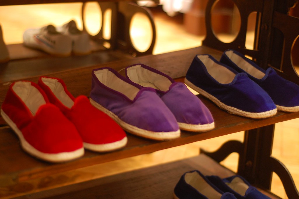
Furlane slippers and espadrilles

SS: Your values can be seen in the quality of our materials and production. How easy was it easy sourcing such quality mills, factories and skilled craftsman from across Europe?
Alexia Hentsch: Well finding them is pretty easy actually because there is such a manufacturing history in Europe and the industry still exists but it is just more expensive. Finding them is easy but sustaining it is hard. As we grow it gets more difficult. We are still in Europe and only in Europe which is great but I understand why luxury products cost what they do and why some brands choose to make things in China as it means they can increase volumes. In terms of local manufacturing we have quite a few funny stories, for example when it comes to our Venetian slippers we are working with a guy who produces them from his kitchen. So we can't bombard someone like that with huge orders in limited time lines and instead he's like 'I will deliver them when they are ready' so you can't really place orders with him and when it comes to colours he gives us what he have. The production can be unreliable but it is part of the charm as well. It is these types of pieces which can really accent our own collections and it is something we can use for our pop up ventures.

SS: A key element of the brand is this idea of building a gentleman's wardrobe and this is mirrored by the development of the brand...
Alexia Hentsch: Yes, exactly! I keep using this phrase which my business partner Max hates because he thinks its cheap but I like to use it anyway...we are trying to build a one stop shop for men to shop. A store for men who we think don't particularly like to shop and one which caters for all of their wardrobe needs. Obviously this will be for a particular look but we can dress them head to toe.

A colourful felt trilby.

SS: The pop up stores can be great in the sense that these men can come in and try on styles and then moving forward they know their size and can order online.
Alexia Hentsch: Yes and even though each season where we add new styles and cuts, we always keep the old ones as well as we build our inventory. So if you know your size in your favourite Jack shirt or trousers you can always go back and find them and they will always be there. We really want to build our offering along with our customer network.

SS: Is there a typical Hentsch Man?
Alexia Hentsch: Certainly. Although there is a whole crew of Monocle-ites, thanks to the two radio shows, and you can see them as soon as they walk through the door. You can tell that those guys have recently listened to the podcast and have visited us accordingly. Those guys tend to buy a lot of the more simpler stuff, like our white shirts and our simpler cut stuff. Then you get a bunch of more eccentric, dapper guys who love nothing more than a pair of pistachio pants. There are some older gentleman who love wearing our brighter colours and we love catering for them. It also depends upon where we are positioned. When we were in Notting Hill originally we had quite a younger, creative crew of guys, whereas now because of the footfall we get many more gentlemen.

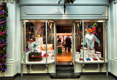
The new store front in Princes Arcade.

SS: How have the two pop up store ventures compared?
Alexia Hentsch: It has been quite different. Obviously the foot fall is a lot better here but it is the Christmas season so it is difficult to tell as there is just a huge consuming element right now. This one has been great though because we are open twice as long. Weekends were a lot busier in the Notting Hill store whereas here, weekends are so much quieter and weekdays are really busy. It is a different vibe here, a little more serious although we've had a couple of really fun, busy events. I think I'd prefer to go back to a slightly more trendy area, we might not do as much business as such but we would be in the right place for attracting the right customer base. At the moment we are seeing older men who might love our trousers but they might not be as interested in our brand. Ultimately, we are going to be targeting a younger, working guy.

SS: When you started the brand did you envisage having a physical store or have you just taken advantage of the current retail landscape?
Alexia Hentsch: It really wasn't part of our idea at all, we were originally purely focused on online and then try wholesale. I actually read an article by Tyler in Monocle (The Retail Issue) in which he discussed how retail was suffering and how councils should fund small shop owners to keep spaces alive. I thought that this was a really great idea so I contacted a council and they obviously told me 'no' but it did make me think. I then dealt with it by finding the right space. So one day it was just a good idea and the next it was a reality but we never thought that is where we would be. Now we are thinking we'd like our own physical store. We think we'll do another pop up store for an additional season or two and then we'd like to be rooted. It would be great to have a permanent space which we can use as our office and showroom, store front. At the moment though as the line develops, the pop up stores are great because they allow us to make some noise and do something exciting.

A selection of colourful Joe trousers.

SS: The white shirt was the thing you designed for Hentsch Man but what was the last?
Alexia 
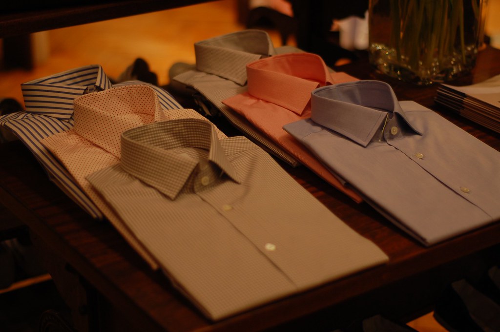
Hentsch: Just now we have only recently finished designing a sports jacket to be sampled for AW10. This is currently being made for now actually, I've not seen the finished sample yet. We are also designing sweaters but I'm not 100% happy with them. So this is what we have going on for AW10 but we have shorts for SS10 which is really exciting because we didn't have them last summer. Plus we have five new shirts in addition to the original Jack which is really exciting.

SS: How does the design dynamic work, do you work alongside Max?
Alexia Hentsch: I work on the designs alongside a pattern cutter and I do a lot of the research. I'm inspired by older fashion, especially from the 50s and 60s and then I get together with a pattern cutter and we have a play around with samples until we get something we like. We really want the direction of the brand to be simple, not to be over designed, just a simple cut with quality fabrics. So it is really more of a research process as opposed to a design one. The search for the fabrics is the most time consuming aspect of it all.

A table of Jack shirts.

SS: You've mentioned being inspired by the 50 and 60s, if you could go back in time to any experience any moment in style is this where you would choose?
Alexia Hentsch: Definitely, the 50s and 60s. It is so popular now because we see it on television and movies. I am obsessed with the art direction and costumes of Mad Men and I'm excited about seeing A Single Man when it comes out. Films like The Thomas Crown Affair are so inspiring, those guys knew how to dress. In terms of my own personal tastes I'd like to go back to the turn of the century when people were incredibly well dressed, they dressed up for the occasion, black tie for dinner, tophats and that kind of thing.

SS: I agree, it is a shame that over the last few decades it seems that men especially have lost the enjoyment of dressing...
Alexia Hentsch: Especially in the sense of dressing up. This is why I like this area because although it might not necessarily fit the brand you see such characters. The older generation and to some extent the younger guys who still dress up. They have canes, bowler hats and this area is so colorful. People often ask why I started a menswear brand and not women's and this is exactly why, the pleasure of a well dressed man. You see well dressed women everywhere and it has become the main feature of the fashion world. if you go to other cultures, for example India, men's attire is so much more elaborate and ornate than women's. What I like about western menswear dress is that the actual dressing is very structured and it hasn't changed to much but what you can change is the little details. Even if it is the look of today with jeans and sneakers, make them good sneakers with good jeans..but I do hark back to a more dressed up era.

A felt trilby which comes from a collaboration with a Parisian based miliner, Le cerise sur le chapeau.

SS: Is there an item of clothing or accessory that you'd like to see more men wear?
Alexia Hentsch: Jackets..good blazers, all the time. Hats as well. A good hat is a lot of fun but you just don't see it anymore. For us though, the hats have done spectacularly well. I guess they are brightly coloured so stick out to people but it is great to see.

SS: What are you current favourite pieces in store?
Alexia Hentsch: I think I will always like the white Jack shirt a little more than the rest but I love our trousers. The cut is really nice, tapered and long, reminiscent of the 60s really and they look really great.

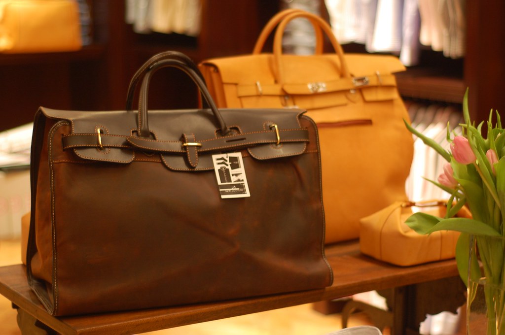
Bags originally inspired by the postman's delivery bags in Argentina are now used as chic weekend bags.

SS: Finally, would you be able to share a few address book recommendation to our readers (hairdressers, tailors, cafes... anything you like really) which we will duly add to our Map.
Alexia Hentsch: I'd say the new APC store definitively. That great bookstore on Lambs Conduit street, Persephone. Oh and that lovely bakery in Bloomsbury, Bea's of Bloomsbury .

Hentsch Man's latest pop up store in Princes Arcade on Jermyn Street is open until 23rd December.

Darjeeling has trunks full of style

The weekend gave me opportunity to watch Wes Anderson's new film The Darjeeling Limited. As usual with Anderson there is minute attention to details and design which extends to clothes; the monogrammed pyjamas, the sunflower coloured bathrobe, the loafers etc. Throughout the film Anderson creates a jovial contrast of Westerners' neutral-toned suits against the hot ochres and turquoises of India (if you are interested most of the movie was filmed in Rajasthan). I want to explore this mix of vibrant colour and neutral tones in the spring, if done well this look will have a great deal of impact, as it did in the film. In another life, Anderson might have been a Dutch genre painters to whom the details of light, domesticity and clothing were the lifeblood of their art and a way to express the everyday humanity of their subjects. A common critique of Anderson's film is that the appurtenances of style are there to amuse himself rather than to uncover an emotional truth; in short all surface and little depth. I am not a film critic but for what my opinion is worth I enjoyed the film (some aspects more than others) but overall it was a pleasant way to spend an evening and gave me a chance to eat sweet popcorn and drink from a ridiculously oversized Coke cup.

One of the stars of this film doesn't even have a speaking part... I could be talking about Bill Murray but I'm not. It's the 11 pieces of distinctive Louis Vuitton luggage made specifically for the movie. The luggage was designed by Marc Jacobs for Louis Vuitton and includes monogrammed steamer trunks, duffels, and suitcases covered in a jungle pattern created by Anderson's brother, Eric. I must admit though I am turned off by them because they are LV but forgetting my own bias these are really nice pieces and they ignite a desire deep inside me to own monogrammed luggage. In fact I quite want to explore charity shops and see whether I can find an old and battered piece of monogrammed luggage. I don't really want my own initials inscribed on the leather- S.S is not needed- just any combination of letters will satisfy me. Let the luggage foraging begin...

EJ: I've not seen the film yet (the weather is far too grim to venture outside), though have managed to find some nice luggage here and here (ridiculously lovely). Not quite the cheap second-hand shop prices I'm sure you were thinking of though. I must say though, if I was going for Louis Vuitton, I would be gunning for this beauty. I've longed for one of these after seeing them in a Fred Astaire film and I'm convinced that it's the epitome of cool travelling.