.

Showing posts with label Prints. Show all posts

One for the future...Yasmin Bawa


Yasmin Bawa is currently a Menswear student at Middlesex University who has sent through her pre-collection, entitled Lattice, for our viewing pleasure. This honours student has taken this opportunity to gather press, media and most importantly feedback on her design work. Bawa has found time to complete a seven look capsule collection and accompanying film. Along with the obvious creative talent it demonstrates she has the business nous to promote her debut offering through the blogosphere. We were surprised and excited when we opened the speculative email from the young talent and had to share it with you. In addition to the film and a selection of stills, the student has sent through a few scans of her research book.


Bawa looked to the hugely popular photography project Family Stuff by Huang Qingjun and Ma Hongjie for initial inspiration. If you are not familiar with the project, it documents the homes of fifty (and ever growing) rural Chinese homes, sees the family with all of their possessions taken from inside their house and placing it outside. The series shows the original artwork and furniture mixed in with modern appliances. Every facet of contemporary life in China is on display, including evidence of those that have changed and remained during this period of modernisation. Bawa's collection combines elements from these rural Chinese villages and the traditional lattice design artwork with a more technical element, showing the social change taking place as modern culture seeps its way into these homes and families.

Inspiration wall.

A look inside Bawa's sketchbook depicting lattice work, fabric swatches and inspirations.

Another look inside her sketchbook and assortment of inspirations for each look.

Chinese lattice work was a huge inspiration for the prints used throughout the collection.
The seven looks sketched.

The battle between traditional and modern elements runs courses through the veins of the seven piece collection to beautiful effect. Natural fabrics, hand dying and screen prints echo the traditional element whilst laser etched prints on cotton drill and leather shows off the use of modern technology. Gradient effects on the fabrics add a further emphasis on the sense of change that is taking place all around the famlies depicted in the photography project, with one colour slowly taking over the next. As a menswear collection it showcases classic shapes whilst creating a whole new look with the colours, prints, function and detailing.

LATTICE Installation hand in

There are times when images just aren't enough. Thankfully, upon the completion of this capsule collection, Bawa soon decided to showcase her designs with a film by Liam Simpson. The design talent was inspired by Carolyn Massey's stunning SS11 film.
 

We think we'll be hearing a lot more from this creative talent in the near future. However, if you are impatient, you can follow the student's progress via her blog.

Autumn Leaves Kicking Boot

IMG_2681

After months of planning, mood boards, factory visits and samples, the fruits of the sixbysixbloggers project officially launch today. Now, if you've somehow missed my previous posts on the project (here and here), sixbysixbloggers is an exclusive creative collaboration driven by global online marketplace Farfetch that showcases the production skills of cool shoe powerhouse Six London whilst satisfying the design whims and extravagent fancies of a selection of bloggers. Along with Susie, The Man Repeller, Stockholm Streetstyle, The Cherry Blossom Girl and Facehunter, I've been able to create my dream pair of shoes - the Autumn Leaves Kicking boot. To think that this design idea has been pinballing around my brain for years has now been realised is nothing short of remarkable. Thanks to the talented team at Six London I've been able to create a true harvest festival of footwear in a limited run of just twenty pairs. Over the weekend, on a perfect misty autumnal morning, I squeezed my feet in to the sample and celebrated the imminent launch by kicking leaves in the park. 

As previously mentioned, the inspiration for my design centred around my love of the timing of its launch. Now is the time when the rich colours of autumn really come into play and I strive to envelop myself in nature's most magnificent palette as much as possible. These Autumn hues of plum, rich red, deep green and various shades of brown should all be celebrated. Even the sound of walking through crisp leaves excites me and I wanted to create a shoe that replicated this feeling even walking on the greyest of pavements. As I walked through the park, surrounded by leaves and little else (the odd dog walker aside), my love for the season was only heightened by the boots.

IMG_2788
IMG_2769
IMG_2759
IMG_2804
Kicking leaves in the boots for the very first time. 
My celebratory outfit includes Dries Van Noten jacket, Whizz Ltd knit and Chinos by Ben Sherman

It is a strange feeling wearing a pair of shoes that you have had some hand in designing. Something I really did not think I would ever do. These boots really are my dream shoes (for this season atleast) and I'm so happy with how they've turned out. This strange feeling will only be heightened if I ever see people wearing them out and about. Thankfully, I've been eased in to this week by a blog post from the lovely Anastasia and Duck. It'll be interesting to see them out of the blogosphere though. 

Now, if you're interested in the launch and in acquiring appropriate footwear for kicking leaves you'll have to be quick as there are only twenty pairs available. Given the limited run of the shoes, the sixbysixbloggers project launches privately today to those who signed up for updates, before launching for everyone else on Thursday. Now, I'm off to kick my way through more leaves...

IMG_2684

Edit: As mentioned above the boots shot here were just samples. I was just too eager and excited to wait for the finished article. However, this morning I had a package from FarFetch. As requested, the leaf print has been tweaked for an even more intense autumnal feel. The result is a much richer print. Without further ado, here they are...

IMG_3088
IMG_3092
Currently only available to those who signed up to receive more information about the launch, the sixbysixbloggers will be on general sale tomorrow. Happy leaf kicking!

Gee Whiz

IMG_0534

During my time in Tokyo this Spring, I enthusiastically pinballed my away across the sprawling city and discovered a myriad of concept spaces both large and small. One of the real highlights was Yuichi Yoshii's The Contemporary Fix. The two floored space takes a gallery approach, installing limited-time exhibitions that spotlight individual brands. The ground level is an inviting cafe and bar that rewards and rejuvenates customers with a welcome respite from consumerism whilst the second is dedicated to offering a selection of the finest Japanese labels. During my visit I was afforded the opportunity to examine a vast offering from Phenomenon, Visvim, Bedwin and The Heartbreakers, Facetasm and SASQUATCHfabrix to name but a few. However, atleast one label slipped under my radar. Thankfully, Susie was recently dispatched to cover Japan Fashion Week and on the very last day she was wowed by the Yoshii curated series of shows, Versus Tokyo. It was here that she was properly introduced to Whiz Limited.

Hiroaki Shitano launched his label in AW 2000. First as simply “Whiz”, then opting to add “Limited” three years later. His line, originally consisting of handmade printed tees for his closest friends, slowly grew in popularity and encouraged him to expanding his 'individual clothing' concept. Inspired by his native surroundings, Shitano is ever evolving his own Tokyo streetstyle outlook. Whilst being impressed with Whiz Limited's colourful parade for SS12, Susie was inspired to revisit The Contemporary Fix to treat me to a little present from the label's AW11 offering. The collection showcases a heady cocktail of prints and patterns, ranging from plaid to Native American tribal designs, to help breathe new life in to familiar staples. 

Screen shot 2011-11-02 at 21.39.55
Screen shot 2011-11-02 at 21.36.54
Screen shot 2011-11-02 at 21.39.32
Screen shot 2011-11-02 at 21.41.21
Screen shot 2011-11-02 at 21.37.27
AW11 look book shots courtesy of Whiz Limited

Even confronted with the well stocked rails of The Contemporary Fix, Susie still managed to keep a clear head and plumped for the item (having had a chance to look at the entire collection) I would have snapped up for myself. A breton reimagined with the simple addition of a tribal knit trim.  

IMG_0540
IMG_0531
IMG_0512

For me, the real beauty of menswear is in the details. After all, it is the small details which are so often overlooked and neglected which can transform any mediocre outfit in to something special. I've said this many times and will ever tire of saying it opting instead to celebrate the designers and individuals who take as much pleasure in celebrating and exploring them as I do. With Whiz Limited, Shitano is one such designer.

Agi&Sam SS12

After the initial excitement of the opening round of shows, the adrenaline of Menswear Day began to be replaced with fatigue and fashion weariness. Just when I needed a pick me up, Agi&Sam offered a shot of 
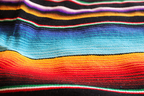
Tobasco, Tequila and Tomato Juice. This was not served in a glass but instead thrown in my face. Weary onlookers like myself were given a visual shock as the exciting design duo took our outstretched hands and led the way on a sartorial journey across Central America. The sights, sounds and smells of a cacophony of cultures and festivities whizzed by and merged before tired eyes deep in the East Wing of Somerset House.

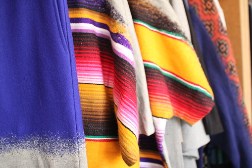
Thanks to their penchant for clashing and layering print upon print, the design duo once again opened my mind to print possibilities. Much like the shooter that inspires the SS12, the duo threw a number of unexpected ingredients together to create something intoxicating yet tasty. In most pieces, references are torn apart, manipulated and reassembled to create eye-catching yet ultimately wearable clothes...

IMG_0740
IMG_0743
IMG_0746
IMG_0749
IMG_0750
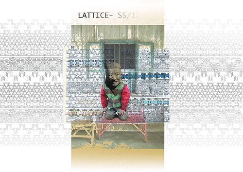
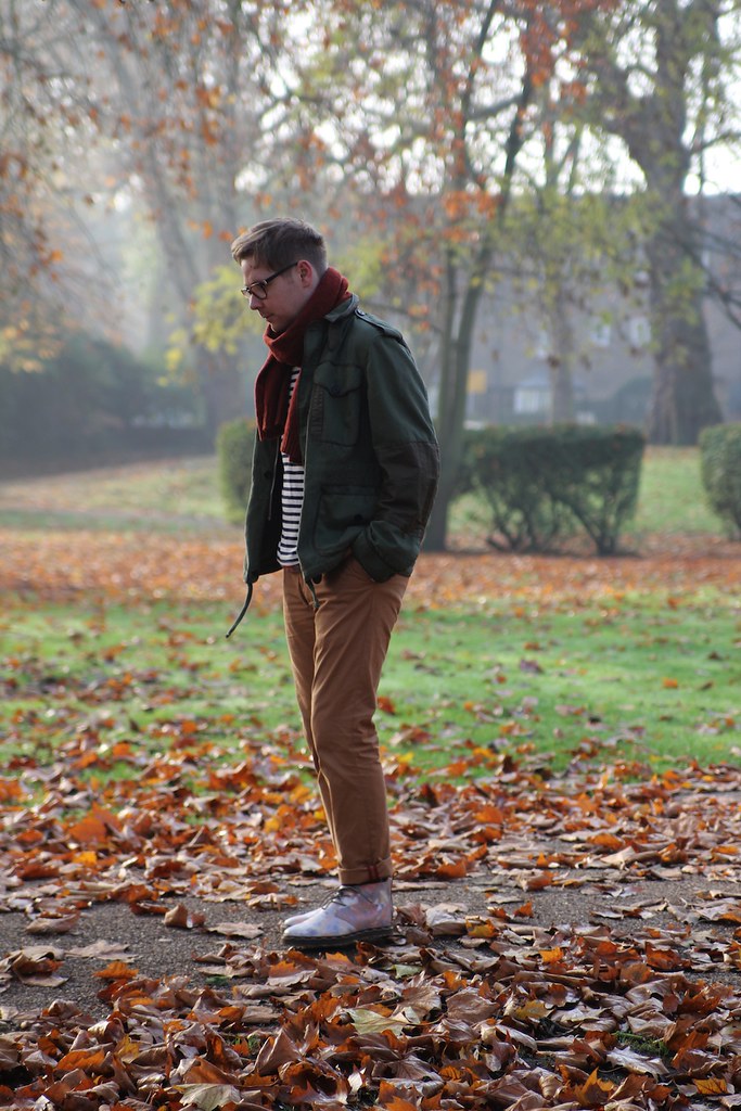
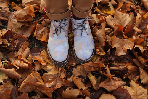
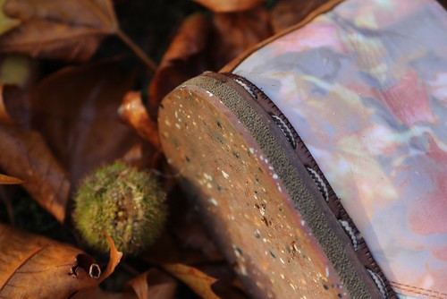
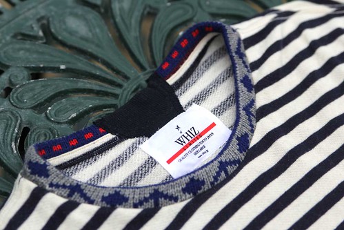
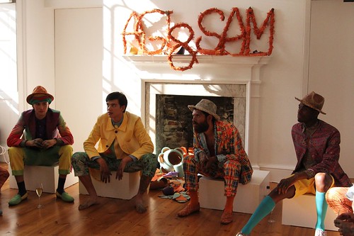
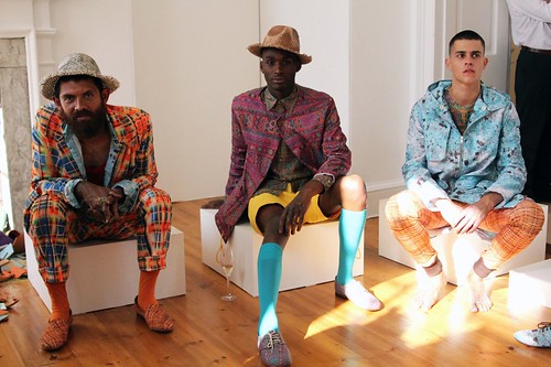
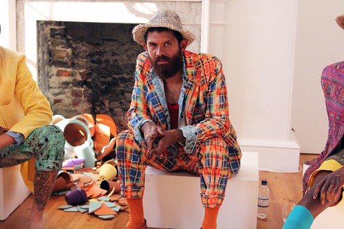
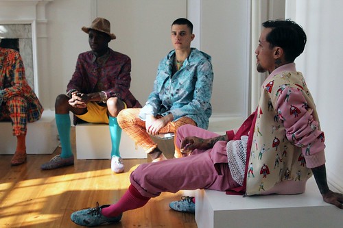
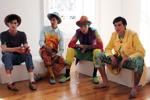
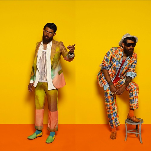
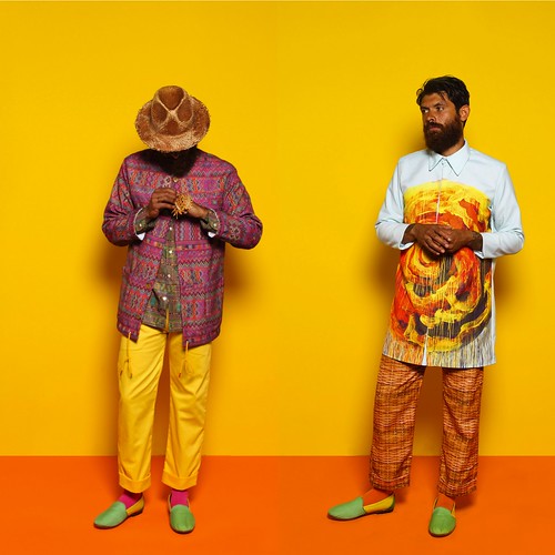
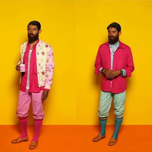
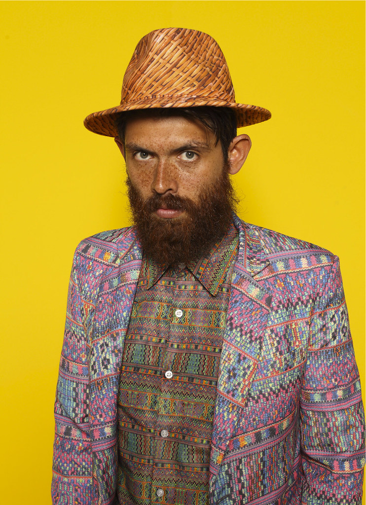
Agi&Sam's cross section of Mexican characters brought some much needed colour to the SS12 presentations.
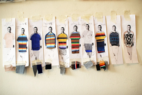
Shots from the many I took throughout a snap happy day.

As the hangover of Menswear Day subsides and the weekend arrives, we could not help ourselves from ordering another shot of tobasco, tequila and tomato. Here we talk through the collection with Sam Cotton as we devour another hit of the hard, colourful print stuff with the help of their look book...

agiandsam ss12 1

SS: Tabasco, Tequila and Tomato Juice takes us on a a journey through a colourful patchwork quilt of influences from Central America. What was the starting point point, what drew you to this region?
Sam Cotton: Tabasco, tequila and tomato juice. It’s a great shot that was introduced to us by one of our friends. It entails the same methods of a tequila slammer but changing the salt and lemon for tabasco and tomato juice, respectively. After one too many we then began waffling on about tequila and its uses within Mexican society. Strangely this led on to thinking about Mexican 'Day of the Dead' and its social significance, the collection evolved from there.

Agi&Sam_SS12_moodboard

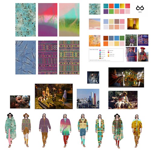
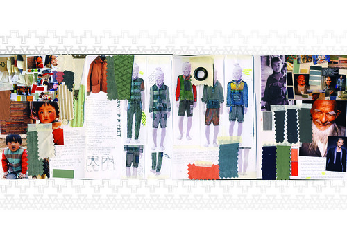
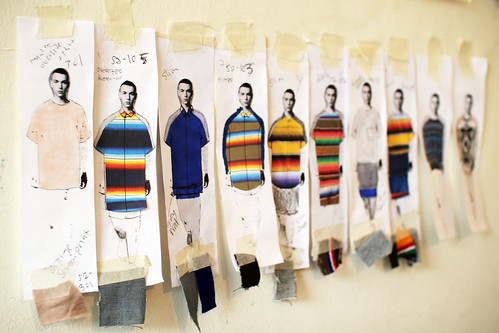
SS: What was your mood board like for SS12?
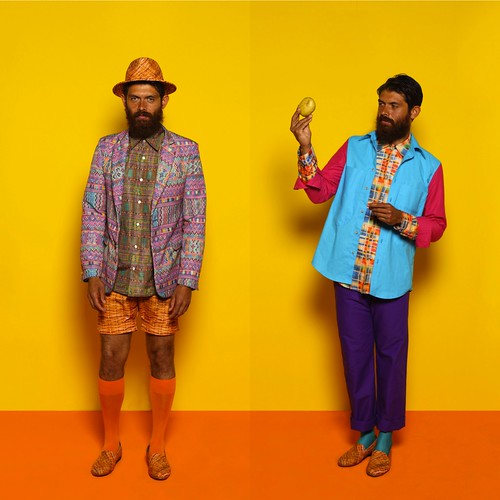
Sam Cotton: For the first time we actually developed a colour palette which was quite unusual for us. Normally we tend to throw things together and see where it takes us, although it has worked in the past we felt this time we needed more cohesion in the collection. When we research we tend to cover an entire gulf of cultural and social influences; artists, photographers, filmmakers, criminals, heroes etc. From this we are able to get a feel or how societies cross over and why. Especially important to our colour palette were the works of architect Luis Barragan; regarded as being arguably the most important Mexican architect of the 20th century. His bold and unashamed use of colour within architecture showed us a way of tying the collection together without compromising the colour scheme too much and risking it looking too safe.

agiandsam ss12 2


SS: How did these Central American influences evolve in to the collection we see today?
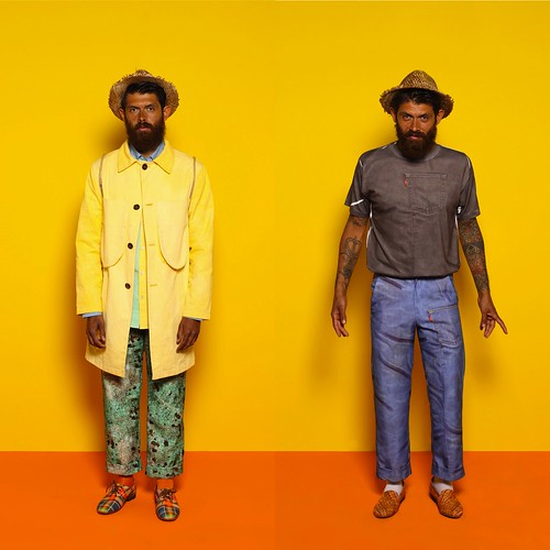
Sam Cotton: We tried looking at a cross reference of the traditional Mexican man. Firstly we began looking at the labourers and farmers of Central America, in particular their sartorial requirements and the functionality of their work wear. From there immigration became a key point of our research, in particular the Bisbee deportation where 1300 Mexican American mine workers were illegally deported by vigilantes on July 12 1917. The workers were kidnapped at a local baseball park and transported 200 miles for 16 hours through desert without food or water before being unloaded in New Mexico without money or transportation.

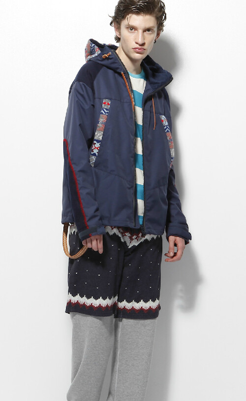
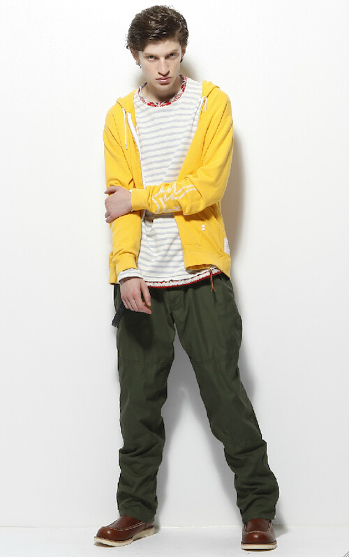
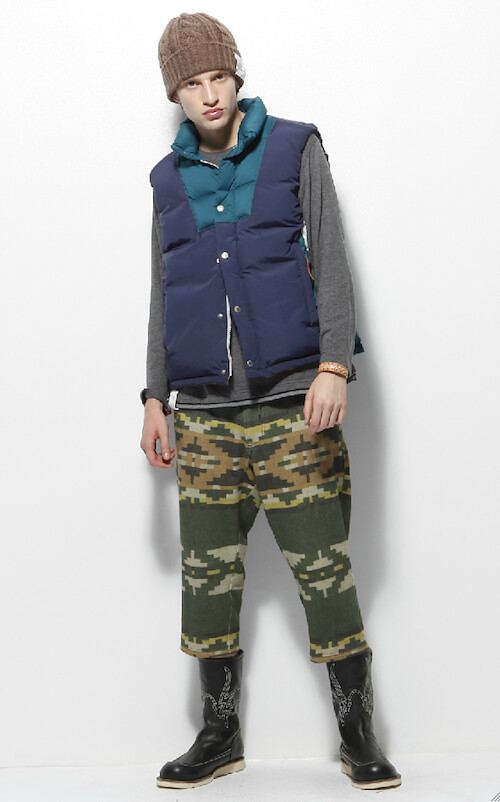
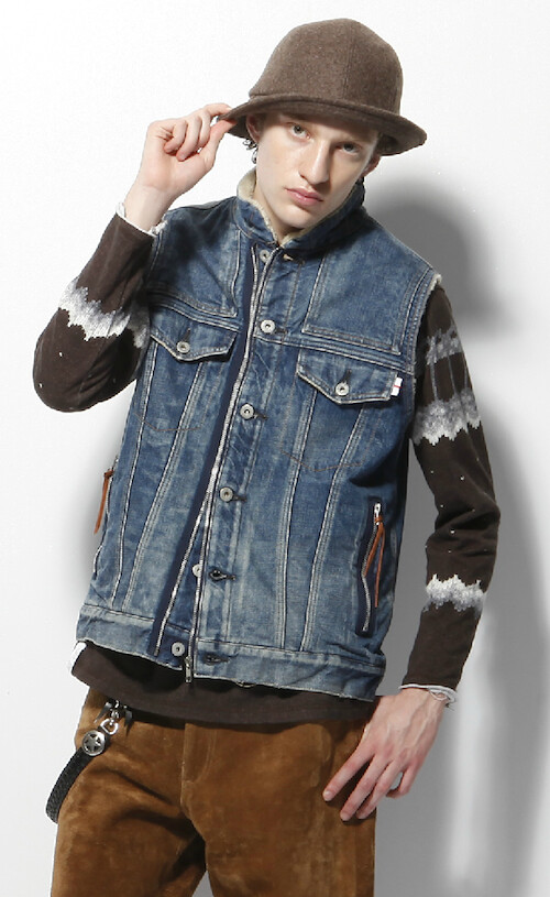
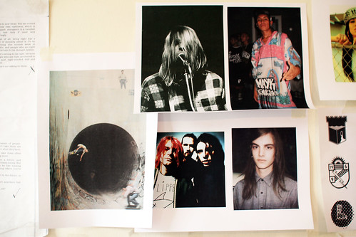
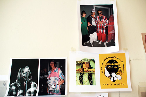
Delving deeper we headed into the underworld, happening upon those living below that acceptable line; those that create their own rules and live under their own guidelines, the gangsters, ‘gangbangers’, drug barons and prisoners. The underbelly of society being the catalyst that propels ‘normal’ life is what really pushed this collection into its reality, and in tow, the idea that one cannot live without the other. We wanted each of the looks to hold characters taken from each of these sub sectors, we like the look book to have character and personality. Some of the shots are of the Agi&Sam Farmers and Labourers, where as others are of the Agi&Sam Columbian drug barrons and prison gang members.

agiandsam ss12 3


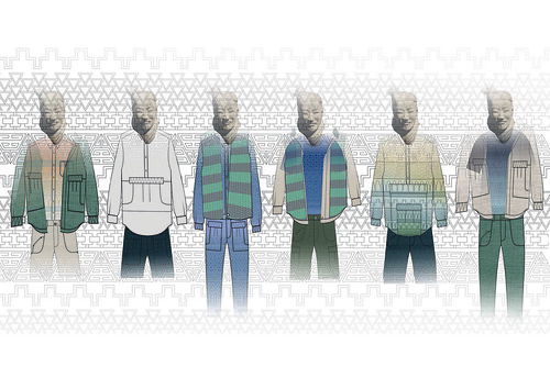
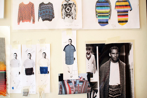
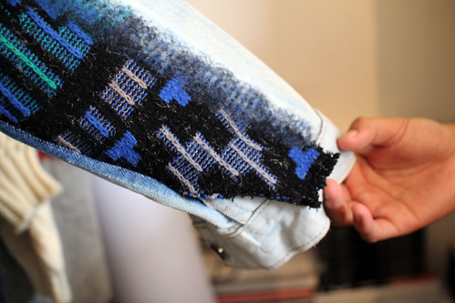
SS: You've experimented heavily with texture and colour, stretching the boundaries of digital printing. In most pieces, references are torn apart, manipulated and reassembled to create eye-catching yet wearable clothes. Could you talk us through a selection of the prints. How were they manipulated and clashed?
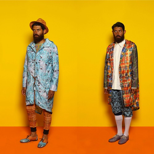
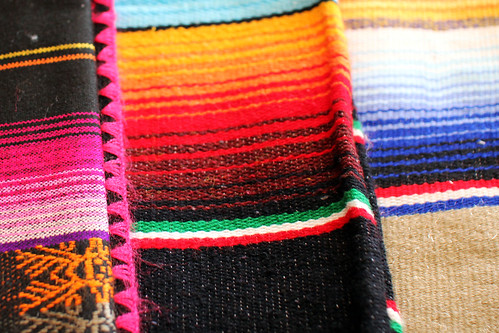
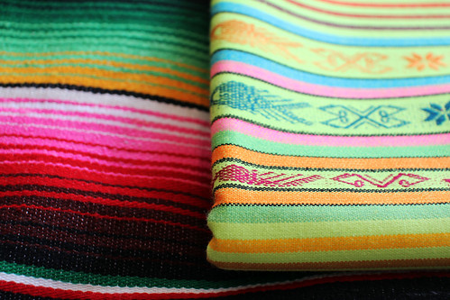
Sam Cotton: We like to play with texture and the whole process of printing, were able to experiment a bit more of certain safer fabrics such as canvas and even plain t shirt prints which in some ways is harder than working with the kind of techno fabrics we worked with last season. As stated earlier we always think big when gathering inspiration for a collection. Having very eclectic tastes can sometimes be a hindrance because you begin to dissect and develop every little bit of inspiration, and this is why our research becomes so wide. Its not always a bad thing as it gives you a lot more scope to play around with but I think this is why a lot of our prints, colours, silhouettes, and details are clashed. For example, one of our prints is a lumberjack, usually seen on ‘the lumberjack shirt’ and the idea of using this came from looking at early 20th century workwear and the photographs of Mike Disfarmer. From a distance this is how it appears but in reality, the lumberjack itself is taken from traditional Mexican blanket weaves, dissected, and placed into an irregular check. This check is then placed over another layer of print, which appears like wood. This is a wooden fence print we designed, and is to signify the barrier between Mexican workers and the land of opportunity; an idea highlighted when we were researching immigration; in particular, the Bisbee Deportation where 1300 Mexican American mine workers were illegally deported by vigilantes on July 12 1917. We did put this print onto a shirt, but instead of following strict rules of expectancies, we smartened it up, and put it on a more classic, tailored shirt as opposed to a work shirt. On top of this we spread the print out over even more garments, such as a tailored suit, a parka, jersey, and within our shoe collaboration. We do this because we believe a print can become more accessible this way, and challenges the way one should look at it, rather than it always being the norm. This is similar to the way we did a Fairisle knit in our ss11 collection to look like knitwear but when you come close you realize its actually a print.

agiandsam ss12 4

SS: If at all, how has the design dynamic that exists between the two of you developed for this season?
Sam Cotton: We don’t think that the dynamic has necessarily ‘changed’, more that it has developed, and maybe hopefully matured. This is our third season together and it feels like now we are really beginning to understand exactly what it is we are doing or trying to establish as a brand. In the beginning we were literally like ‘okay lets make some interesting clothes that contain our own prints and can inject humour into fashion’. Now we are reading between the lines, tweaking things, and playing off each others strengths and weaknesses, so that we can develop in the best possible way, and with a clear direction and vision. We want the brand to have some kind of longevity, so we are purposefully tackling it from all angles.

The last two collections we did were all out of Agi’s living room floor and we had no stockists so this was never in our heads. Since AW11 was released in Feb, we’ve picked up six stockists, a joint business account, a proper studio, interns, and dealt with factories and production. So with this, came quick responsibility, and I guess this is what pushed us to think more intelligently and maturely about Agi&Sam. In a way its amazing to see it progressing, but sometimes you take a step back and realise, ‘its not just making clothes with your friend anymore’ its an actual business. And that is ridiculously scary.

agiandsam ss12 6


SS: This season marks the debut of two new collaborations to provide the accessories for the collection. Printed oxfords and slip ons with New York shoe brand Osborn and fedoras and straw hats with J Smith Esquire. How did these collaborations come about? How was it working with both of them? Who would you like to work with in the future?
Sam Cotton: Accessories and shoes are something we’ve always wanted to do, and when Agi was at uni he always thought of complete ‘looks’ rather than individual separates. We’ve done them in some way or another in past seasons but they’ve always been done in house, and, to be honest, not that well. So in keeping with our wanting to mature and grow as a brand, we thought now would be the perfect time to collaborate with people that could actually do it properly. We actually stumbled across Osborn shoes through a friend during the research stage, and were instantly awe struck with they’re amazing designs and how similar they were to the kinds of shoes we’d imagined in our minds. The fact that they are all fair trade and cobbled together in Guatemala almost felt like fate so we simply got in touch with them began the collaboration process.

The same thing happened with Justin Smith Esquire, we had been looking to collaborate with a milliner for a while especially with this collection in mind and our friend mentioned he was a nice guy and he might be up for collaborating. He certainly was for both of those things and even on a last minute deadline of about two weeks he was able to produce these incredible hats, both printed and made from straw.

It’s hard to tell for the future of collaborations. We don’t like working with the obvious as its all a bit too easy and safe. It’s more exciting to work with a brand that is either new or a bit left field. Although the idea of someone like Nintendo or FILA would be quite exciting but it would have to be relevant to the seasons direction. We tend to mix up our influences for every season and not stick to a certain type of design, one season we could be inspired by sportswear and FILA would then be relevant but then the next we could be doing worker wear like this. Although saying that maybe it would be interesting to approach FILA in a worker wear way. So scrap that last paragraph, haha.

agiandsam ss12 7


SS: Finally, what's next for Agi&Sam?
Sam Cotton: Another season, another collection. We are working on production for the second time which we feel a lot more comfortable with now after the first year. Our first stop will hopefully be Paris again with the BFC at London Show Rooms in January. It was such an eye opener for ourselves, especially for the kind of quality you need to be producing in our position, it was also great to stand back and almost hold a retrospective on what we had designed for SS12. It didn’t change the initial design ideas we had but it gave us a chance to add key things into the collection and start polishing the entire thing.
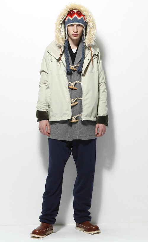
agiandsamss12_feature
Look book credits:
Styling by Rose Forde, photography by Luke Stephenson and 
modelled wonderfully by Jerome Robeiro
----------

Always aiming to be revolutionary in their approach to print design, Agi&Sam once again experimented heavily with texture and colour. Stretching the boundaries of digital printing and pushing me to consider unexpected print combinations. As colourful and dazzling the collection certainly is, I'm most excited by the design duo's continued evolution. Having brought so much to the Fashion East Menswear Installations for two seasons now, I'm in little doubt that this pair have a bright future. 

Menswear Day Preview... Shaun Samson SS12

IMG_7044
Shaun Samson's SS12 lineup

In precisely one weeks time we will be half way through a packed Menswear Day schedule. We would have Asd been amazed by Anderson, seduced by Shannon, dazzled by Dalton and moved by MAN. As we countdown to the big day, it is the latter that is causing our blogging pulse to race. Since its inception and thanks to the support and sponsorship of Topman and Fashion East, MAN has created a whole new momentum in the London menswear scene. Season after season, it grows in profile and importance but the SS12 lineup marks an energised beginning. The talent showcase is all about heralding what’s new in menswear but this lineup is one of the most exciting to date. Martine Rose shows for the third time and is joined by two newcomers, Matthew Miller and Shaun Samson. Now, regular readers will know that Miller is no newbie in our eyes. His work has impressed us for a number of years now and after capturing the collective imagination with his AW11 presentation, his addition to the show lineup marks a much deserved step forward for the design talent. Samson on the other hand is a recent discovery. 

Having stood out with his seamless MA collection of harmoniously fused knits and plaids earlier this year, we met up the California born graduate to learn more about his needle punch felting technique. As we were talked through the design process of his AW11 collection, we could not help ourselves from peeking at what he had in store for us on Menswear Day. Here, we take a look at how colourful Mexican blankets sparked a renewed love affair with his homeland and accompany his words with a few studio shots....

IMG_7031
IMG_7030
IMG_7028


"I was initially really attracted to these Mexican blankets. They are everywhere in California. However, it wasn't until I moved here and away from them for a couple of years before returning that I saw them in a new light. I'd never think to put these colours together but for some reason they work.  They are made in the traditional way by Mexicans and use whatever yarns they have at that time. No two blankets are the same which is great except for when it comes to production but I'll figure it out. The blankets are so nice themselves that I can't over design the garment."


Shaun Samson on the starting point for the collection and the confident use of colour in the blankets.

IMG_7038
IMG_7042
IMG_7045
" From the blankets, I reminisced about growing up in California; the surfers, the grunge and the gangster rap movement."
Shaun Samson on the evolution of design influences from the blankets.

IMG_7041
IMG_7046
IMG_7033
"I'm also experimenting with one off pieces that I won't produce, mixing vintage garments and pushing the aesthetic that bit more"
Shaun Samson hinting at what we can expect to see on Menswear Day
----------

Style Stalking... Imelda Matt

You might think that the phrase 'style stalking' is an exaggeration, but this time you'd be wrong. Ever since we laid eyes on Imelda Matt in a gold suit we knew we just had to get him to do a style diary for us. After months (no, really) of chasing, cajoling and downright begging, he agreed. For those of you who don't know him (shame on you!), here's a little background: since unleashing Her Royal Highness Imelda the Despotic Queen of Shoes on an unsuspecting blogosphere more than four years ago, his sharp tongued take on the wonderful world of women's shoes has brought many a smile to our faces. It has been a firm favourite in our blogroll for as long as we can remember. More recently he launched the aesthetically pleasing Style Tyrant, a street style blog that focuses on the men of Melbourne. Just check out this guy if you need convincing!

Here's what Matt has to say for himself about his style diary:

Gurrl! Haz you been tokin’ on the crackpipe?” was the Despotic Queen/Style Tyrants response when Eliza asked if I’d consider doing a style diary!

Over the course of the last four years (during which time I’ve been blogging full-time) my bank balance and thus my wardrobe has been on life support.

Blame the GFC. Blame blogging. But for whatever reason, two and half years ago and in dire need of new threads, I started ‘shopping my wardrobe’, hence in lookin’ at my old rags?

But revisiting my purchases of yesteryear with older (albeit wiser) eyes has been a fascinating exercise. Aside for a few key pieces (Orri Henrrison and Subfusco) approximately 90% what I wear was bought during my 20’s.

Obviously, to accommodate my shifting taste my old rags have given a spit and polish. However, for as cash strapped blogger from the 3rd World I’m kinda impressed with how those early buys have stood the test of time.

These photographs are not a study of sartorial chicanery - what you see, is what you get!

The wait was well worth it though, we are absolutely delighted with the images. When the diary dropped in to our inbox the collective squeal of excitement deafened neighbours. No doubt this style diary will brighten up your weekend...

----------

Day One - Double Denim


Denim jacket is vintage JAG, Shirt from H&M, the jeans are ‘ready for the bin’ and shoes are vintage Hutton’s Playboy creepers

----------

Day Two - Subfusco


Entire outfit (including the Patrick Bateman vinyl blazer) from Subfusco, shoes by Pierre Hardy

----------

Day Three - Orri


Jacket and pants by Orri Henrisson, shirt from Saint Augustine Academy and boots picked up in Tokyo

----------

Day Four - Armani


Trousers are Giorgio Armani S/S 96, belt is Dolce & Gabanna circa 02, knit Arthur Gallan

----------

Day Five - Helmut


Jacket is Helmut Lang ‘98, trousers are Dolce & Gabanna S/S ‘97 and the shoes are by Max Kibardin

----------

Day Six - Gucci Belt


Gucci Belt – Jacket by Orri Hennrisson, vintage trousers, belt by Gucci S/S 97, shoes from Kenneth Cole and watch by Nixon

----------

Day Seven - Burberry


Pants from Burberry, Shirt by RESTERÖDS, Cardigan from Tiger House (Japan), Shoes from ZARA, vintage belt and rings by ATAT

----------