.

Showing posts with label London Collections: Men. Show all posts

Inspired... Baartmans & Siegel AW13

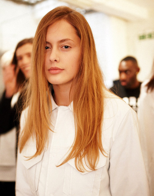
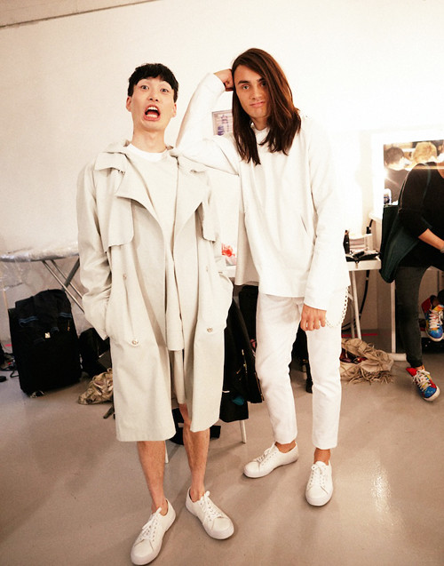
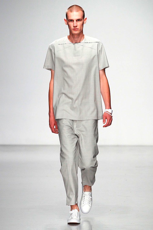
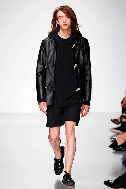
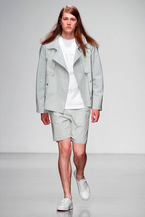
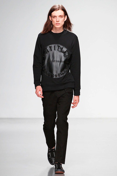
"We wanted to look at military but not in the obvious heritage sense. We looked at Vikings and imagined warriors, our minds filled with thoughts of sabotage and a more romantic feeling," muses Amber Siegel as she stands in her Centre of Fashion Enterprise studio located in the heart of East London and excitedly introduces Baartmans & Siegel AW13. Self described as modern-traditionalists, Siegel and her partner Wouter Baartmans' work focuses on beautiful fabrics that seduce, and shapes that are accessible yet distinctive. In a few short seasons the talented twosome have developed a signature of innovative, refined menswear that balances wearability with a heightened luxury and ever irresistible tactility. Theirs are designs to fall for and it looks like we'll be falling that bit deeper in January. 

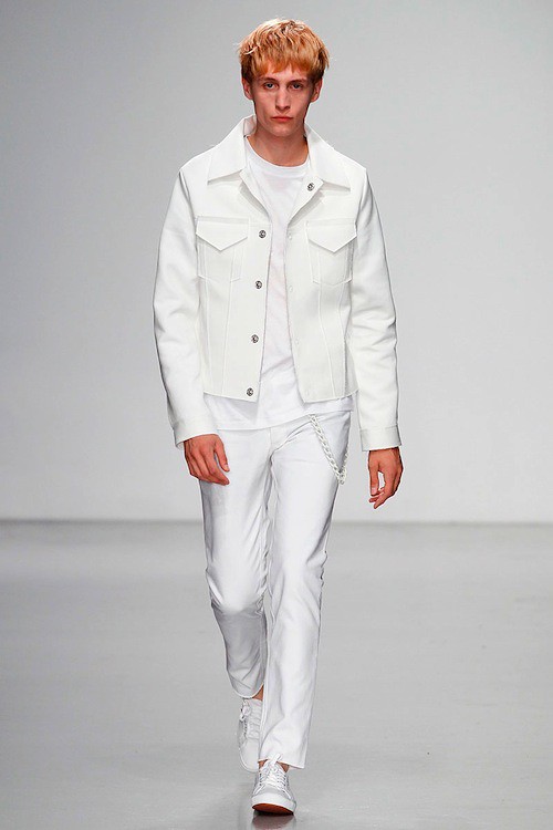
Now, for the latest Autumn/Winter collection the duo switch on their design blender to create an appetite quenching blend of masculine references in vibrant palette of red. Amber Siegel talks us through the studio's mood board...

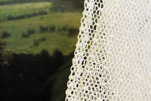
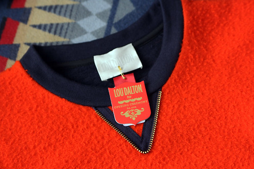
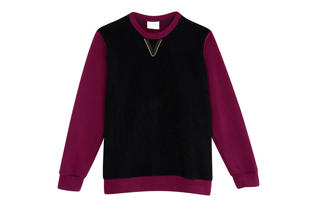
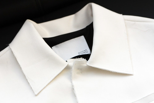
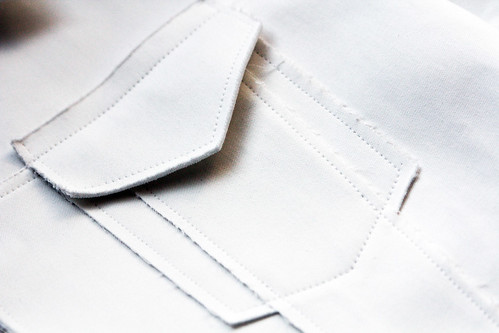
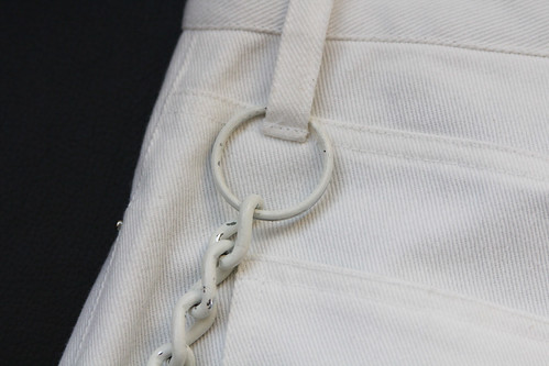
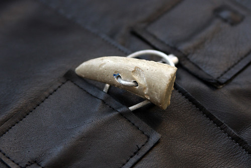
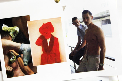
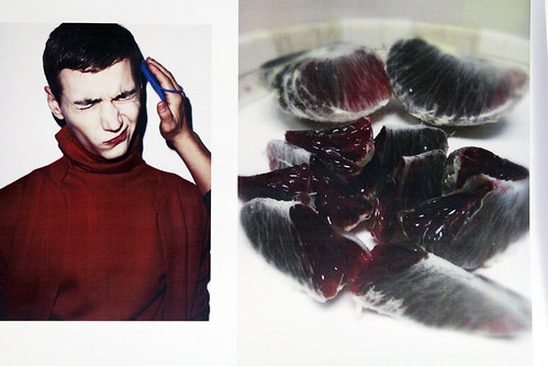
"We were drawn to the image of Brad Pitt jogging alone in the opening of scene of 'Birth'. There's such a beautiful piece of music playing over it and we loved the idea of this solitary guy in the elements interjected with wolves, it just captured the mood of the collection. We then searched for more lone figures but with the wish of building a community. Very colour based but we also looked at visual detailing, especially pockets and this led us to military uniforms. We wanted to explore a different side of military. It was more about how a soldier feels. Ideas of protection with vulnerability, belonging and distance from home. We are are more thematic than conceptual but we were drawn to this duality. Many of our other seasons are about internal masculinity, internal confidence given through clothes, feeling secure through the outerwear and we wanted to project that further so looked at the role of colour. We were drawn to reds in particular. We loved the look of blood oranges, on the outside they can be matte but the inside has this warmth and we translated this in some of our jackets with the use of neoprene linings, cross mink linings, suede alongside a more performance fabric. it is all about this duality. Something quiet teamed with real warmth. A hard outside with a soft centre.

We both really love Jeff Bridges. I want him to be our muse and he certainly inspired us this season. If anyone comes in to contact with him, please call me. I like this idea of him being this oddball, he could look groomed and cool but he's a stoner We made a Jeff Bridges rob, The Big Lebowski style. We played with this feeling of English loungewear crossed with LA cool and Viking warrior. A melting pot of slightly strange masculine references that come together to create something truly Baartmans & Siegel. Actually, given the berry tones throughout the collection, a blender is more apt..."

IMG_9463
IMG_9420

IMG_9446
IMG_9449
IMG_9459
IMG_9451
IMG_9453
IMG_9456
IMG_9438

IMG_9430
IMG_9443
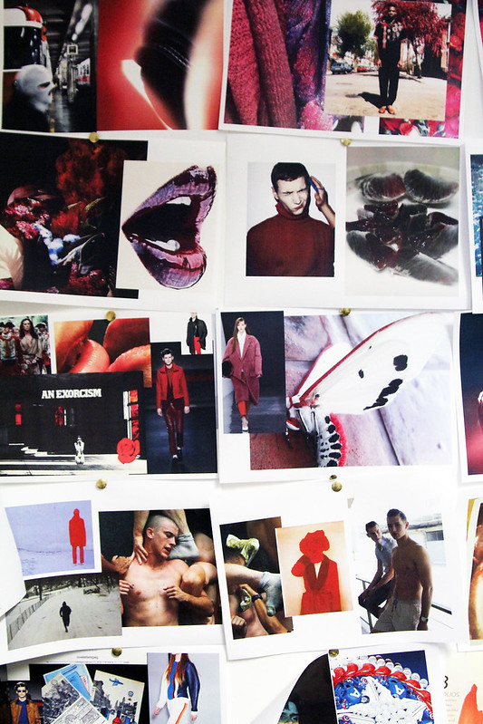
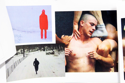
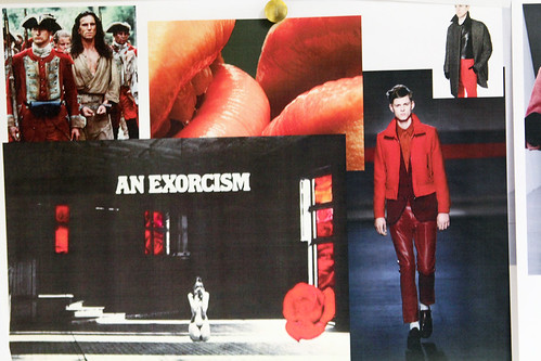
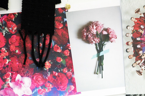
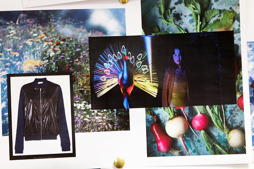
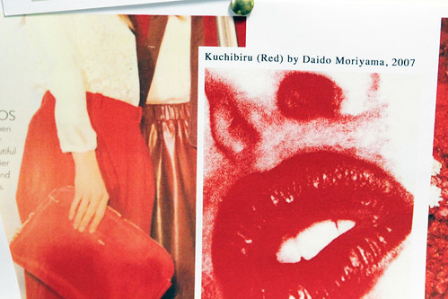
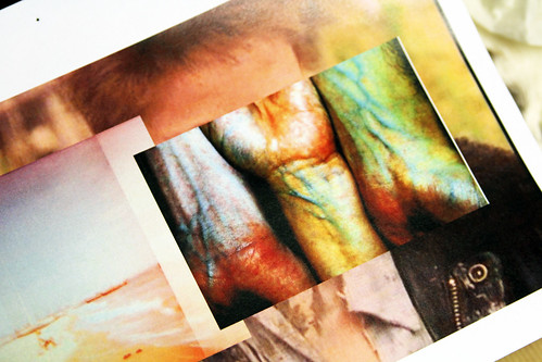
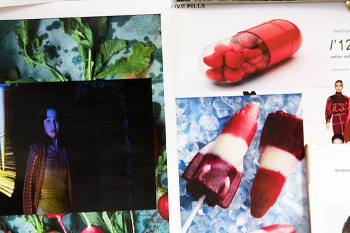
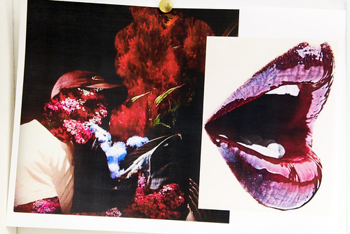
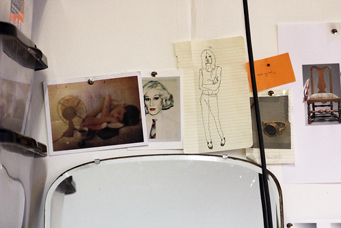
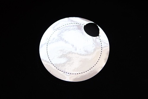
A quick look at Baartmans and Siegel's mood board for AW13
----------

Having been talked through Baartmans and Siegel's mood board and the opportunity to see and touch the first few samples, it is clear that many more will fall for the charms of this label. Once more this refined design pair will showcase a wearable wardrobe of our dreams in January at London Collections: Men.

Inspired... Marwood AW13

As London Collections: Men is only a few hectic weeks and with the festive break somewhat inconveniently popping up right in the middle of proceedings, throwing a spanner shaped mince pie in the works, it is about time that we began our seasonal preview. Over the coming month we will sit down with as many of our favourite design talents as possible to hear all about their inspirations for the autumn/winter 13/14 season. To kick off this whirlwind of tea and biscuit fuelled curiosity, we headed to Dalston and in to the warmth of Becky French's shared studio to take a look at her latest mood board for Marwood.

The emergence and continued rise to prominence of Marwood has been a fittingly delightful journey. We've been enthusiastic passengers ever since we first encountered French's working sketchbook of research and exploration in 2010 and watch on in pleasant surprise as the label trundled through its landscape of carefully crafted lace on to an ever more texture rich vision. Season after season, French's destination is always to produce beautiful neck wear that can be loved by it's owner and worn time and time again. As she embarks on the next leg of what is always a tantalising trip, French talks us through her route and introduces us to a world of English eccentricities and Gallic sartorial peacocking...


"I was thinking about and looking at journeys. Train journeys mainly because I found myself going to Devon, it's a beautiful trip going back and forth and I'm from Somerset originally so I know the route well. I always prefer going by train because you can soak up the scenery. Whilst travelling back from spring/summer 13 showroom meetings in Paris, I began thinking about this season. So, a number of photos on my inspiration wall are snapshots from these journeys along various tracks. I've got loads of them. They document how the landscape and colours changed and the result is a blur. I wanted the collection to be a journey through an eccentric English landscape and an interpretation of classic and familiar scenes in to textures within the ties. From passing cricket grounds and admiring their jumpers into Aran and blurred countryside in to herringbone and the sighting of a kingfisher evolved in to something more abstract. I always want the collections to be heavily textured but for this season I was keen to explore a more graphic side for the jacquards.

I was chatting to Scott Trindle about the look book for this season and the inspiration for the styling and the mood that I wanted to express can best be understood by looking Jean Cocteau. In particular, Cocteau in 'The Mirror and the Mask'. It's an amazing book. I picked it up from a car boot sale and it's one of the first books that I looked at when I started Marwood. It includes an image by Irving Penn which sums up everything. I keep going back to it. It is such a strong pose, sheer confidence, and I love everything about it but especially the combination of textures and pattern. The look book will play with staged poses and the styling."

IMG_7863
IMG_7864
IMG_7867
IMG_7868
IMG_7870
IMG_7875
IMG_7872
A quick look at Becky French's mood board for Marwood AW13
----------

Marwood's is a journey that will never provoke that all too familiar whine of 'are we nearly there yet?' because the route that Becky French steers us is just too beautiful. Rich, diverse and full of surprise, these are trips that we all long to take.

Burning the midnight oil

IMG_9810

"Having both the main line in Opening Ceremony as well as the capsule collection is great," Lou Dalton beams proudly over the Internet. "Both are very different, each say something different without compromise," she excitedly exclaims. Joining forces with the rousing retailer, the design talent takes our hands again, leads us across the border once more and we fall for the charms of her imagined rig of Zetland Oil all over again. Through Opening Ceremony's youthful filter, her autumn/winter 13 collection's sartorial sharpness softens and becomes that bit more sportier. As with her own collection, the collection's personal narrative falls seductively from the lips of the designer but here it feels like a fresh tale.

Having first been approached by Opening Ceremony for a series of London based designer capsules around the 2012 Olympics celebrating the store's arrival in the capital, Dalton chose to explore cycling and intricately incorporated house signatures into the sport whilst making a point of it feeling a little more commercial and easy-to-wear. Unsurprisingly, the collection went down a storm and with this in mind she approached Opening Ceremony earlier this year to do something similar and this latest collection evolved from these speculative conversations.

"I enjoyed creating a fictional Oil Company called "Zetland Oil" for autumn/winter 13. 'Zetland' is an old Nordic term for Shetland. Shetland is such an inspiration to me. As you know I met the Haigh there (Justin Haigh, Lou's fella of 10 years) who just so happens to work for an oil company that has an oil port in Shetland. The other logos used within the designs are all inspired by oil company branding from in around the late 70s mid 80s but re-worked and all carrying reference to Lou Dalton, either the year I was born or Shetland itself.

When I first discussed the ideas for the range with Opening Ceremony and the t-shirt prints in particular, we all agreed on the idea of making them take on a sporty mood. I looked at making them appear quite Motor Cross branded. For me, it was integral to incorporate the store's branding into the capsule as much as my own. As the collection was to be a little easier-to-wear and even more accessible than the Lou Dalton main line, I kept it easy and quite relaxed. However, I did want to give it a strong reference to the Lou Dalton main line and did so by introducing one of the fabrics we had used on the autumn/winter 13 mainline which was a particular favourite of mine, this being a cloth that I refer to as Bobble. This cloth came in a whole ray of colours but for Opening Ceremony, we kept it to a tomato orange, bordeaux and black. Throughout, this collection felt very natural. I always believe that if it feels forced then you should just leave it and move on. Opening Ceremony are so great to work with, they understand and appreciate design and its end use without it becoming to banal."

LouxOC_5
IMG_9804
LouxOC_
LouxOC_4
LouxOC_2
IMG_9817
The capsule collection includes caps, t-shirts, jogging bottoms and sweatshirts.

Opening Ceremony's ever evolving relationship with some of my favourite London design talent, mixing straight main line season buys and really considered capsule collections, the fruits of which manage to balance the aesthetics of everyone involved perfectly, shows the way for other stores to follow. Meanwhile, Lou Dalton is sketching a fine blueprint that other designers can look to for inspiration. Since launching her own line in 2005, Dalton has refined a well crafted reputation for rebellious English sportswear with a keen eye for and attention to detail whilst establishing herself as the real shining starlet of British Menswear. As London menswear has demanded an ever increasing presence at London Fashion Week and respect far beyond the perimeter of the capital, evolving from an afternoon in to three full days of shows, presentations, previews, installations and exhibitions under the umbrella of London Collections: Men, she has matured in the spotlight, built a brand and helped pave the way forward. Long may Lou Dalton continue to strive forward and here's hoping more follow.

Matthew Miller's Manifesto. SS14 and beyond...

"I make clothes," Matthew Miller succinctly states as we beckons me into his brave new world for spring/summer 14 currently housed in DMSR London's central London showroom. "So many designers refers to themselves as artists and I can't relate to that. I just don't see myself as one. However, instead of me being an artist, I want to shift it and turn every single wearer into the artist. It's fun to allow the consumer to play a part in the final product." As all encompassing as it sounds, clothes maker oversimplifies Miller's pursuits. A disaffected designer, a textile theorist, a contumacious creative and a sartorial sophist are all far closer to the mark but the mere mention of any of them would make this design talent wince. Ultimately, Miller is a simple soul with a complicated mind.

For the last few seasons he has begun to challenge conventions. For spring/summer 13 he explored the concept of having to destroy something to make it beautiful and introduced it to pull-to-tear t-shirts and in subsequent collections, it's an idea that has been further refined. Matthew Miller now sees each garment as an experience. From catwalk right through to purchase, the designer considers every step.  The rulebook has been laser cut, screen pasted and masterfully manipulated in his eager grasp and this spring/summer 14 season sees the focused force unveil his manifesto.

Now his work whispers that un-sourceable quote of "artists create problems, designers solve them." That's precisely what Miller is, a problem solver. Now, having honed his technique and provided significant yet small solutions over the course of ... quietly successful seasons, the designer has begun to decipher the Miller enigma. "When I went to a NEWGEN meeting a couple of seasons back, oki-ni's Ben Banks said that he kind of got me but didn't completely understand my work. He felt that I didn't quite know what I wanted to say visually yet and that was a massive kick up the arse to be honest because he was right," he confesses. Taking this constructive criticism on the chin, the designer dived into the deep waters of introspection. "This season was a case of redefinition. My starting point was to set out a clear vision and message. Rather than just continue to design a completely new collection each season, coming up with an idea and moving on like I always have previously. The communication of objects, destruction and decay through individuality, SS14 is the introduction of a new manifesto for the brand.  It is about setting something on the path of evolution with the aim to continually strive to improve," Miller explains through excited eyes. This collection sees the designer lay the solid foundations of the brand and allow it to grow. Having looked at everything that came before, it was all about focussing the label on a fruitful future.

"I arrived at a new label. Matthew Miller has faded from direct significance. For me, my name was secondary. I needed to create a graphic identity that people would instantly recognise after a couple of years. The same as Nike's swoosh, or Margiela's stitches. That was the biggest thing this season. I didn't pass it over to anyone, it was my task and my task alone to redefine the label. I was absorbed into the graphics, fonts, spacing...everything. We worked up so many samples of the labels just to get the right feel and texture. There were no short cuts. I was conscious of this collection feeling like a luxury label. Basically, everything that buyers say London labels aren't, they often remark how much they love the creativity of the capital but are ultimately put off by price points and placement. For us, moving forward we will be carrying over entry level detailing, from collars and cuffs in our shirting so these were as considered as they could possibly be this season."

The rich identity bubbles throughout this considered collection. As the first slender, topless frame turned on its minimal stage of white, a familiar yet fresh focused force introduced itself. The proclamation ‘Untitled, Mixed Media, Variable Dimensions’ was scrawled onto pale backs and grew ever louder. The words were confidently echoed throughout a series of industrial sportswear brandishing the slogan. For spring/summer 14, the designer’s investigation into the technological versus the traditional took the most purposeful and confident step forward to date as branding is stitched seamlessly with ideology. Away from the political and philosophical broadcasts there were details to truly believe in with unfinished hems, exposed seams, cracked paint finishing, laminated labels mounted on wood and slotted onto the rear pockets of denim and wire rope and concrete combine to recreate duffel coat toggles. It might not have it on the label but spring/summer 14 is Matthew Miller


MM-10
IMG_0692
MatthewMiller_SS14_03
MM-5
IMG_0624
MatthewMiller_SS14_02
MM-7
IMG_0632
MatthewMiller_SS14_04
IMG_0710
MM-3
IMG_0599
MatthewMiller_SS14_05
IMG_0598
MM-8
IMG_0592
MatthewMiller_SS14_10
IMG_0609
MatthewMiller_SS14_08
IMG_0679
MatthewMiller_SS14_07
IMG_0640
MatthewMiller_SS14_06
IMG_0677
Backstage photography by Piczo, runway shots from catwalking.com and detail shots are mine.

"Everyone who has seen it has said that the collection makes perfect sense and have bought in it," begins the designer, "the books haven't closed yet but this season has already doubled on the last and we've brought on atleast ten exciting stockists," DMSR London's Greg Hewitt excitedly finishes. Ever since this design talent first came to our attention with his standout RCA MA graduate collection which explored notions of masculinity with a somewhat jovial approach to the macabre, we have kept an ever interested on Matthew Miller's continued development and deserved rise to prominence. Today, there's a noticeable maturity to Miller and a balance to his designs. The pull of creativity and commerciality are matched as Miller pushes on.

"When Topman start doing digital prints you need to work with different techniques. For this season it was taking it back to screen printing, I wanted to make it more hand made and that's difficult to replicate. The screen printing was overseen a good friend of mine, Caroline Carrig, I went to Uni with her and she works for Zandra Rhodes. I'm looking forward to working with her moving forward.

The range has been built up in such a way that stores can buy into it. We've been working hard on the quality of finish and pricing. Nothing works out at over £1,000 on the rails. It goes back to the Alexander Wang thing, you can't sell something as expensive as Balenciaga or Dior because you've not got their history and you can't compete, you have to work harder."

With his head done and eyes focussed on the future, the result is the beginning of an exciting business. "It's just evolving your perspective. If blokes wear t-shirts and jeans, how can I creatively sell them? How can I reinvent it? What will set me apart? Creativity shouldn't stop at the garments, you can creatively set up a business, you can creatively communicate something, you can creatively reconstruct something, redefine manufacturing." Matthew Miller is dead, long live Matthew Miller.

Treasured Items... Aitor Throup

Despite existing on the periphery of the industry whilst working on other creative endeavours, few London designers have left more of an impression on contemporary menswear than Aitor Throup. From the moment he graduated from the Royal College of Art in 2006 with an MA in Fashion Menswear with an accomplished collection entitled 'When Football Hooligans Become Hindu Gods,' the industry has salivated over this great talent. But he has made them wait. Throup is a designer that will not be rushed or pushed in to anything. Everything has to be just right before he moves on it. The wait was over and duly explained in a packed presentation at St Martins Lane hotel during London Collections: Men. With a refusal to conform to fashion’s restrictive six month cycle, Tim Blanks, Sarah Mower and the designer himself discussed his philosophy before unveiling the articulated manifesto 'New Object Research' that will guide his design destiny. Parts of the industry might well have been confused but the overriding feeling was that of excitement. Throup has devised a new way of working, a fresh business model that will allow his justified design philosophy to flourish and allow people to buy his designs. Earlier this week I spent an afternoon with the designer at his Hoxton based studio and showroom but before I transcribe our long interview, I wanted to follow the lead of Throup himself by whetting your appetite with an introduction. Now, as a designer more concerned with product design than fashion, I felt the best way to help reacquaint you would be to take a look at his most treasured possession.

Born in Buenos Aires, Throup developed his passion for labels such as Stone Island and C.P. Company whilst growing up in Burnley from the age of twelve. Ultimately, it was this keen interest in the products of Massimo Osti combined with his love of drawing that led him to begin a BA in Fashion Design at Manchester Metropolitan University and on to an MA in Fashion Menswear at the Royal College of Art in London. So, it should come as little surprise that Throup treasures one of Osti's most iconic and rare of creations...

----------

Aitor Throup and the fibre optic jacket that lights his imagination...


IMG_9670
IMG_9675

"I believe that this is the first jacket ever to incorporate fibre optics and marked the twentieth anniversary of Stone Island. I just love the simplicity of it and how the light transforms it. Given that it around a decade old, it is a little broken now as some of the optics have snapped but it still continues to excite me. There's a subtlety now. It is almost eerie in a way and reminiscent of garment dying with the tonal differences of a number of fabrics. If it was just a block of blue it could be too artificial and alien to the garment but by going on and off throughout it becomes part of the garment more holistically, there's something really special about that. 

A mate of mine found it, he knew I was after one and one of his friends just so happened to have one. Another friend of mine who is one of the biggest Stone Island and C.P Company collectors and just so happens to be from Burnley like me, has got a few pieces from transformable series that Moreno Ferrari did for C.P Company that he is ready to sell, so I am getting them and I couldn't be more excited. They might not be the best pieces, like the inflatable armchair jacket, but they are awesome. Hey, they are transformables which is fucking cool! 

They are a massive part of why I became a designer, those pieces and items like the Goggle Jacket. It's all about product. If I go in there and put the jacket on, it would be nice but I almost get more enjoyment looking at them to be honest, same with Goggle Jacket I buzz of the fact that it's got a face. It's like a superhero costume. They are more valuable as objects. It is why my whole thinking isn't about styling and fashion but instead about making a cool object, suspending it and looking at it - let's geek out over it."
----------