.

Showing posts with label Interview. Show all posts

Inspired... Kit Neale AW13

"Fashion East Installations give the newest of the new in London menswear the chance to prove their worth in a group show of delicious controlled anarchy," proclaims Charlie Porter in the recent press release for autumn/winter 2013. Ever since they were introduced to the London fashion week schedule back in 2009, I've excitedly bounced from room to room inside its various incarnations uncovering the beautiful alongside the wonderful and even the unusual at every opportunity. The platform provides discovery at every turn for us whilst offering invaluable exposure for the designers themselves and often acts as a springboard for them. Nothing quite represents the diversity of London menswear design talent quite like the Fashion East Menswear Installations. Returning to the impressive and ornate Georgian townhouse in the heart of St. James’s alongside Meadham Kirchhoff, Bobby Abley, Joseph Turvey, Nasir Mazhar and Maarten van der Horst, Kit Neale will once again be a noisy neighbour to Buckingham Palace for the day.

Ever since I first stepped in to Kit Neale's dazzlingly printed world,  a cultural kaleidoscope that reimagined suburban and multicultural Britain, I've been eager to return. Despite being just over two weeks away from London Collections: Men, I couldn't resist popping by his new showroom cross studio located just off Shoreditch High Street for a sneak peek at how the new season is taking shape. Moving on from his Dad's allotment and the ever eccentric great British seaside, the emerging sartorial chronicler of our age looks to his design heroes and ends up sozzled in his local. Reviving him with the rustling of a bag of pork scratchings, Kit Neale talks us through his mood board and allows us to take a sip from his heady cocktail of influences...

"The real starting point was looking at three of my design heroes of Michael Clark, Ray Petri and Ernő Goldfinger. I'm always researching them. I'm obsessed. Ray Petri's 'Buffalo' book has pride of place in the studio, it's our bible and I always look through it and I know many other labels look to it as well. I'm really drawn to those Buffalo days and often look through my old issues of The Face and Arena Homme Plus. I think Petri, Goldfinder and Clark all have a level of influence over or appear in some way in every season but I wanted to delve a little deeper and fuse all three in to this collection but it wasn't possible to look at all three due to this being such a short season so I chose to focus on Clark. It's been a bit tight this season and this shows in the fact that the prints have just come back, the Friday before Christmas but I'm really pleased with them.

There's a film that Michael Clarke did with Leigh Bowery called Hail The New Puritan. It's a fake documentary, a mix of narrative, performance and fantasy. If you've not seen it, you really should watch it on youtube. The vivid colours of the film really inspired the prints for this season. There's one particular scene where they are in a typical British, slightly run down pub and the contrast and clash with these colourful characters is so intriguing. It led me to think about the role of the pub in society, they're a place where all types congregate and it also directed me to all of the pop references. I looked at so many names, signs and details of pubs but in the end we concentrated on The White Polar Bear and The Queen's Head. The prints combine the pub detailing with the vivid colours of the film and the movements of Michael's Clark's dance."

IMG_9543
IMG_9502
IMG_9532
IMG_9529
IMG_9519
IMG_9506
IMG_9599
IMG_9582
IMG_9564
IMG_9550
IMG_9570
IMG_9517
IMG_9489
IMG_9586
IMG_9590
IMG_9469
A few snapshots peering in to Kit Neale's mind.

Much like looking at Martin Parr's photography which can at first appear exaggerated, Kit Neale's plentiful prints fuse the familiar with the strange, the mundane with the extraordinary. Entering his presentation space last season I was instantly transported back home to the sandy beach of Margate and I'm looking forward to going off on a jaunt to one of the designer's locals to share a pint with his design heroes. What's your poison?

Exploring Common's Wilderness for SS13

Few debut collections cause such a well deserved flutter as Common's did for AW12. Yes, the Lars Jonsson collaborative sparrow print exquisitely applied to bomber jackets set pulses soaring but it was the Swedish duo of Saif Bakir and Emma Hedlund's mix of design cultures and desire to showcase local manufacture and craftsmanship that really captured our imagination. Having graduated from London College of Fashion and Central Saint Martins respectively before honing their skills whilst working for both Wooyoungmi and Kanye West, the talented friends returned home to Sweden to craft their design dream. With its heady cocktail of contrary elements and constant play of dualities. From street wear and traditional menswear, combinations of vintage and innovative and wardrobe staples alongside seasonal specials, there was an assured balance and sartorial mixology throughout. It was a debut all too easy to get drunk on. The excitement was not just limited to the blogosphere, buyers were just as enthused and the collection has just nested in Tres Bien Shop and Storm.

For Spring Summer 20123, the design duo continue on their shared quest for an elegant modernity but choose to fuse it with the rough and harsh realities of boot camp. As with last season's accomplished debut, Wilderness' focus is on a Smörgåsbord of wardrobe staples proudly sitting next to more colourful and unique showpieces. It is a wilderness to get lost in. As the latest Patrick Lindblom shot look book was unveiled we decided to have a virtual sit down with the talented twosome...

Common_SS13_2

SS: After graduating from London College of Fashion and Central Saint Martins respectively and working with both Wooyoungmi and Kanye West, you returned to Sweden to launch Common. Where did the two of you meet and what was the catalyst for ultimately launching Common?
Saif Bakir: I met Emma back in 2004 at London collage of Fashion where I was doing my  BA degree and Emma was at the time in her foundation year before starting her BA at Central St Martins. We were both a huge support to each other during our degrees. We worked closely together and constantly picking each other’s brain and exchanging ideas. It wasn’t until Saif moved to Paris and joined me as head of designs at Kanye West that we got to work together professionally and realized that we were quite compatible on many levels. Setting up Kanye’s studio and label in Paris we came to realise that we could be doing the same thing for us and this triggered the desire to run our own label. So when Kanye decided to move the studio to London we thought it was time for us to set up Common

Common_SS13_1

SS: Evolving out of this design background, I'm fascinated by the label's seemingly effortless fusion of personality traits from London, Paris and Scandinavia. How did your experiences at college and working in Paris influence your aesthetic?
Saif Bakir: Our collage years in London has influenced us greatly, the diverse style of the city is a huge inspiration and very much part of our identity as a label.  Living in Paris our sense of style matured and became more sophisticated.  We usually describe Common's identity and aesthetic as a fusion of London-edge, Paris-chic and Scandinavian-minimalism. 

Common_SS13_3

SS: Expanding on this identity of fusion, what does Common mean to you? What can you tell us about the story behind the name?
Saif Bakir: The name for the brand is Common and the company is called Common Affairs. Both names play on the different synonyms and meanings of the word common. The idea came about of having something in common with our customers, followers and the factories we work with and also creating something common in a very uncommon way.

Common_SS13_4

SS: With 'Wilderness', you are continuing your quest to create an elegant modernity whilst combining many facets. What did your mood board look like for SS13? What inspired you?
Saif Bakir:  For Spring Summer 2013 we explored our fascination with a “bad boy” attitude so we started looking into youth camps for troubled youth but also scout movement back in the 30s and 40s.  The combination of harsh and tough yet disciplined and sophisticated are contrasting elements that inspired us for this collection.

Common_SS13_MoodBoard

SS: The collection flows from the accomplished debut collection seamlessly. For example, a number of key pieces from AW12 including the Helmut and Bomber jackets, could you describe their use and refinement for the latest season?
Saif Bakir: Our collections are continuous, a story under constant development. We want our collections to be able to sit together as one. The Bomber is one of the cornerstones of our collections and is one of the pieces that we constantly develop and refine. As for the Helmut jacket, it is one of our top sellers and a perfect jacket for both autumn and spring therefore we found that it should be carried over but in a new fresh summery colour. 

Common_SS13_5

SS: In both collections there has been a real visual and graphic edge. What can you tell us about the evolution of the gallop print for SS13?
Saif Bakir: For SS13 we wanted to dig deep in our Swedish handicraft heritage and find an artist with an expressive and unique style. We wanted to look for a collaborator in an un-common and unexpected place for a contemporary menswear label As the National Association of Swedish Handicraft Societies, Hemslöjden turned one hundred this year. They held an exhibition to mark the anniversary and this is where the expressive work of Hans Krondahl caught our eye. We contacted Hans hoping he would find Common, our ideas and values equally as interesting. It turned out that he lives just around the corner from us in Malmö so he joined us for coffee and a chat in our studio. Looking through Hans work we were drawn by the bold graphic style of the print Gallop. Together with Hans we decided to give this print a new lease of life by updating it with a new colour way and playing with proportion and scale.

Common_SS13_6

SS: There's a real sense of collaboration, both between the two of you, your Swedish manufacturers and creative talent that you work with each season. How important is collaboration to Common? Who would you love to collaborate with?
Saif Bakir: Collaborations are in the DNA of Common and a key feature in our collections. To emphasise this we launched COMMON GROUNDS. A platform were we each season will bring in a new Swedish creative collaborator.  For future collaboration we would love to step out of our comfort zone and work together with a designer from a different discipline perhaps a furniture or product design or even architecture.

Common_SS13_8

SS: Craft and local manufacture are obviously very important to you both and the label is proudly made in Sweden. From what I can gather, Sweden is a bit like the UK in the fact that it's a challenge to do so. How have you found it sourcing and working closely with Swedish Producers over the last two seasons?
Saif Bakir: To produce in Sweden has proven to be a greater challenge then we thought. Much of the know how and skills has unfortunately already diminished. This does unfortunately restrict and limit the possibilities of producing a full range in Sweden. We still aim to work as much as possible and when possible with domestic companies and manufacture. 

Common_SS13_9

SS: Finally, how would you like to see Common continue to evolve over the coming seasons and beyond?
Saif Bakir: Our aim is to constantly remain current in our thinking and to bring new and fresh ideas. We would also like to see Common featured in an international menswear fashion week in seasons to come. 

Common_SS13_10

Look book shot by Patrick Lindblom with art direction by Stinsensqueeze and styling by Andrej Skok

----------

This pair were never in the design wilderness. There's a definite sense that Common's collections are continuous. Creative evolution. Their's is story under constant development and I cannot wait to continue reading and watching the pair develop.

General Eyewear's Inner and Outer Space Collection

"Eyewear has gone from being a specialised niche product to being almost tediously ubiquitous – every brand and every designer has an eyewear collection. And this, along with a few other factors, has led to a general flattening out of what’s on offer," Fraser Laing fervidly expressed on one of my previous visits to his great gem of Stables Market. General Eyewear has concentrated on developing its own distinctive values and ideas without paying too much attention to what anyone else is doing. His wide, passion filled eyes are focussed on providing something more, something better. Now, as we sit inside his emporium of eyewear, he introduces me to the latest development, the Inner and Outer Space Collection. A long considered range that breaks free from the tedium and emerges on the recently unveiled Discover Boutiques.

Chatting over a concerto that echoes throughout the vast retail space, Laing becomes increasingly more animated as, one by one, he proudly places each of the nine frames on to the desk. As ever, his eternal enthusiasm and perpetual passion is as infectious as it is justified. From the 40s inspired but wonderfully contemporary Metz to the uncompromising Tanaka, each frame, which is handmade in England by their master spectacle makers using the very best components and finest vintage Italian acetates, is named after a Science Fiction writer. "We made a long list of science fiction writers and began honing it down to find the perfect fit for each style," Laing explains. Playing with the author's different characteristics, what they represent or conjure up and even just revelling in the name themselves, from phonetics to onomatopoeia. "For example. I know Lem quite well, he's a Russian science fiction writer and I just had this feeling of what a pair of glasses might look like, heavy and ponderous. For another frame, the Ostrander we just felt that they needed a strange name without knowing too much about the author, after a little research we found out that he penned the original Star Wars screenplays. The name just felt right because they appear older, mysterious and austere." Some of the names will be familiar, others might stump even the most arden of SF fans but what is certain, their latest incarnations are taking eyewear to new heights. Now, making use of the beautiful product photography that Discover Boutiques uses to present the stock from its partner stores, let me introduce the collection to you...

130226-general-eyewear-camden-stables-glasses-lem-002
general-eyewear-54_920x1000
130226-general-eyewear-camden-stables-glasses-lem-003
general-eyewear-53_920x1000
130226-general-eyewear-camden-stables-glasses-flamarrion-002
general-eyewear-52_920x1000
130226-general-eyewear-camden-stables-glasses-asimov-003
general-eyewear-55_920x1000
130226-general-eyewear-camden-stables-glasses-matheson-002
general-eyewear-58_920x1000
130226-general-eyewear-camden-stables-glasses-resnick-002
general-eyewear-59_920x1000
130226-general-eyewear-camden-stables-glasses-saberhagen-002
general-eyewear-60_920x1000
130226-general-eyewear-camden-stables-glasses-tanaka-002
general-eyewear-56_920x1000
130226-general-eyewear-camden-stables-glasses-metz-002
130226-general-eyewear-camden-stables-glasses-metz-003
From the Lem to the Saberhagen to my personal favourite the Metz.

"The starting point was that they are built around classic shapes but evolved to become borderline unusual. We've been raiding our archives. From as far as I know, no one, in London at the very least, has anything quite like it. It is really coming in to its own now as we developing styles from itNone of these styles will be in people's minds, they are all slightly unusual doing slightly different things. It was about matching up the shapes we wanted to make with the right plastics. For the time being, we are sticking with one plastic per shape. The idea is that each frame becomes a brand in its own right because they are such distinct styles. Of course some might fade away but the hope is that these are a starting point and variations will follow, always looking to improve."

The considered collection has evolved from and takes advantage of the attributes that really set General Eyewear apart from anything else out there. The frames have evolved from an alchemy of form and function from favourites from the archive to the components, from the alluring acetate to the finest hinges possible, and craftsmanship that come together to make them. Laing's museum level stock consists of tens of thousands of unique pieces from the nineteenth century right to now. Inspiration is at every turn, inside every drawer and waiting to be found in an unmarked box.

 "We started offering custom made frames very early on but we were very limited by the lack of acetate available in the UK. I embarked on a mission to buy surplus stocks of acetate from the more historic factories that I knew about in France and Italy. The fact that I was able to find so much of it means that the selection of different materials we’re able to offer in the shop is unique. Today, there's only really one factory that produces plastic for everyone because it is highly, highly specialised but the history of it is so much more varied. Italy has always been associated with the development of plastics, it is of course a comparatively recent invention, reaching its peak in the 50s. This one factory that began in the early twentieth century were building everything up, providing all of thee amazing plastics for all sorts of uses, and then in the beginning of the 90s and it must've come as a shock to them, the world just stopped wearing plastic glasses. Armani, Ralph Lauren... every brand that you can think off was making little metal frames. Today, the current catalogue just doesn't have the same choice, the same variety. However hard you look, there's nothing in the direct line of those fantastic marbled ball point pens of the forties and fifties and it's such a shame."

Thankfully, Laing managed to accumulate close to four tonnes of the acetate that continues to excites today and give it a new home at General Eyewear. Some of it might be fifty years old but it is far more interesting than anything on the market now. Up until now Laing's vast collection of acetate has only been used for commissions but they wanted to do something more with it and the Inner and Outer World collection is one of the finest ways to breathe new life in to it.

"The reaction, even before we put them on the website has been great, we have put one of two out on the shop floor and they instantly attracted attention." The frames are limited. They begin with a limited run of just five and a number of the frames have sold out but with in a week or two more can be made and be on the shop floor (both in Camden and the virtual one thanks to Discover Boutiques).  "The aim is to continue to have this flagship collection made in the UK and we can be very ambitious with short runs, spinning everything around the acetate. The logistics have been tough. Very few people make anything in Europe because it is not easy," Laing reflects as a wide grin spreads across his face and a glint or two flashes in his eyes. The results, at least in this instance show that it is all worth it.

The rise of Craig Green

IMG_0283

"We always put ourselves under pressure," Craig Green confesses before his wide smile spreads across his Bethnal Green studio. As we're sat in a hushed corner, the light filled space is alive with activity, during the supposed festive break, in preparation for his third and final MAN performance. His name glows from the London Collections: Men schedule. In a whirlwind of promise, he has emerged as the crowned prince of the adventurous silhouette, transforming beautiful boys with wearable masterpieces and abstract theatre. The weight of expectation would weigh heavy on the shoulders of most design talents but Green, backed and spurred on by his closely knit team, shrugs the pressures of others off from his broad shoulders whilst floating ever higher powered by the pressure he places on himself.

"We try to change it up and push it each season, we don't want to stick to what we've done previously. We don't want to be just one thing. I think there's a fear in fashion to move away from what you're known for but it's good to feel uncomfortable and scared at times. As with most seasons, I'm scared about autumn/winter 14 but it's exciting," Green adds, eyes wide, full of focus and enthusiasm.

This fearlessness combined with his undeniable talent and hunger has propelled Craig Green forward and deservedly won him the hearts of the press and pockets of the world's finest buyers but it can be divisive. The pitchfork wielding tabloids were furious with an incensed Daily Mail dedicating a number of pages to their angst fuelled, confused rants whilst a perfume peddling waxwork mocked the designs live on Alan Carr. "I even received hate mail, directly to me, after the first MAN show. I was so depressed that I began to questions what I was doing. A week later people made me see that it's good to split opinion at times," he adds wisely. It is. Having bounced our way across the full spring/summer 14 spectrum, it could easily be described as a season of nice. Banality can be contagious but Green is one of the few designers offering something new, something exciting "For me, it's important for a show to be a show. It's really rare now that I look through catwalk photos and dream of being there. There are very few experiences like John Galliano's couture. any and every Comme show or the recent Rick Owens show. Gareth Pugh was the first ever show that I went to. I rushed from Central Saint Martins to make it and we were the last to get in, it was amazing, my heart was pounding. Shows should make you feel something special and that's what we strive for."

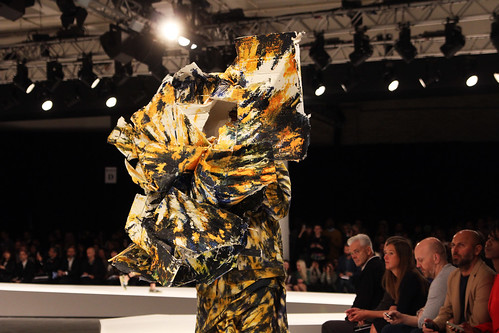
His tribe of faceless, psychedelic sculptures emphatically established Green as one of the capital's brightest stars but pushing continuously, excitement has closely circled Green from the moment his three dimensional, Russian folk robot inspired fantasies floated down the Central Saint Martins BA show catwalk. A collection that bubbled with creativity and craft, seeing him awarded a full MA scholarship. Weeks after presenting his award winning final MA collection, he confirmed his promise at the inaugural London Collections: Men. Offering another glimpse into his world of well crafted whimsy, the emerging talent, with his tonal crinkle washed calico, mohair and muslin cheesecloth creations, was the standout highlight at Fashion East's Installations.

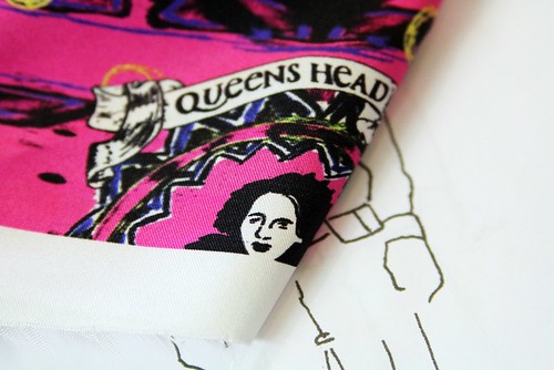
"I'm drawn to making something out of nothing, or very little. You get the cheapest materials and use your skill to make it expensive." For Green, the real craft is in the textile transformation, in fabric alchemy, elevated do-it-yourself. "That first collection was made out of calico that we washed, tumble dried and put in a salt solution that softened it, before hand painting the edges. It was a cheap collection but that's an important idea not to lose sight off. Rather than buy silk and make something expensive, we're interested in using more attainable materials that can be improved, it's more of a challenge. The cost of producing in London already rises prices so we save where we can." Green thrives on challenges and constantly introduces them to his work, both out of need and his desire to push it that bit more.

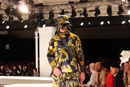
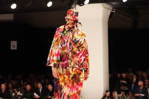
"We do textiles in-house. All of the tie dye of spring/summer 14 was worked on here. 450 metres were dyed twice in metre by metre pieces. Twisted, poured, washed, left to dry for three days and then repeated. It was a nightmare process but this season, we're also working on a nightmare process - we love it really. Everything is hand painted, there's no digital or screen printing and they are heavily worked. We're back to handmade textiles and techniques but it's a different feeling.""

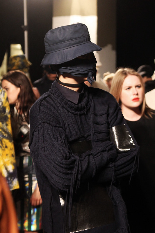
Creating and solving problems each fabric, silhouette and pattern at a time, Craig Green dances, delves and delights in duality. Opposites attract in his studio. His closely knit team of fantastical friends and crafty collaborators, don't just blur lines or introduce opposing forces but rather, majestically manifest creative collisions. Each garment is the playfight of light and dark, traditional and modern, familiar and fresh, reality and fantasy.

"The first collection played with seriousness, the spring/summer 14 was poppy and played with darkness and euphoria. We design by thinking about what we'd be excited to see in a show at that moment. This collection clashes utilitarian and ornateness. function and unfunctional, traditional and new. It's grounded in tradition because we were conscious of it not being seen as too faddy because there's a lot of that around. The challenge is always to do something that is not expected."

"Each season starts with the feeling that we'd like to portray, that always sounds a bit poncey but it's true. 'What do we want to see now after everything that's been?' That's always the driving force. We never stop talking, driving each other mad. I'm on the phone to Helen at midnight discussing every minute detail, discussion leads everywhere, from the studio to the pub, it's an ongoing process. This season has shifted and changed. Things get made, are scrapped and we start again. It's one of the most last minute collections but for the better. 

I never say my, it's always us and we. Perhaps I need the comfort of others but we do work so closely together. We're friends that like to make things. Different moments have brought us together, from old boyfriends to house parties to studying together. We all get on. They love doing what they do, they're not doing it for anything but the love, they are all crafty people and that's who I'm attracted to. It causes problems in it's own way because we push each other and can make things more difficult for ourselves but it's good. We just have a laugh," he adds before giving into a quiet giggle. Over the course of our hour long chat, Green didn't deviate from 'we' or 'us.' There might be one 'i' in Craig Green but the design talent is not one to downplay the role of and interplay between, the team of creatives that nestle under his umbrella.

Now, Craig Green could happily and skilfully turn his hand to any creative medium, so why, for now atleast, ground himself in London menswear? "It is one of the very few places that is open to suggestion and not scared of change.” Growing up in a quiet enclave of suburbia in North West London. surrounded by a loving family of craftsmen, Green's daydreams were filled with aspirations of being a sculptor or painter. "I initially went to Central Saint Martins because I wanted to be a portrait painter but whilst on the foundation course, I met friends who were studying fashion." Thankfully for us, the impressionable young talent followed suit and fell into fashion, textiles are now his canvas as he shapes a new modern menswear menswear between his hands. Beyond the fabulous fanfare of his MAN shows and as the applause fades, a Craig Green collection continues to captivate with delicious details long after the curtain falls. 'The beauty is in the details,' is an oft used phrase in menswear but when Green is concerned, beauty is omnipresent. With sweaters that artfully unravel, garments tie-dyed with a richness that forever teases the eye, a subtlety that envelops any considered viewer and a knowing of touch that excites the heart of all craft enthusiasts.

IMG_0146
IMG_0166
IMG_0147
IMG_0172
IMG_0279
IMG_0290
IMG_0268
IMG_0286
IMG_0271
IMG_0276
IMG_0295
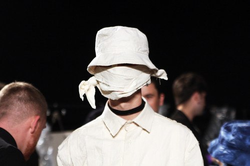
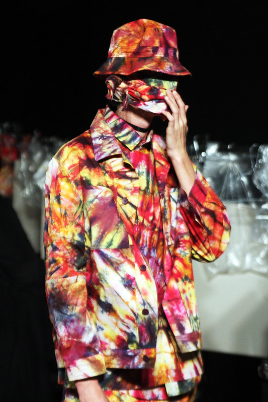
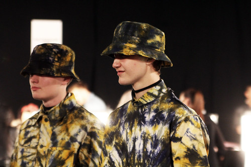
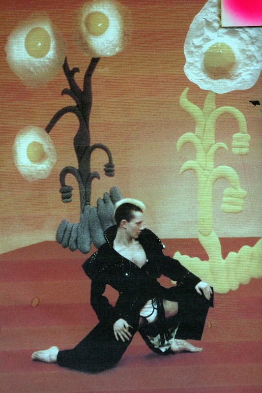
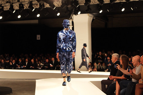
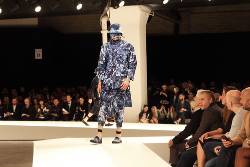
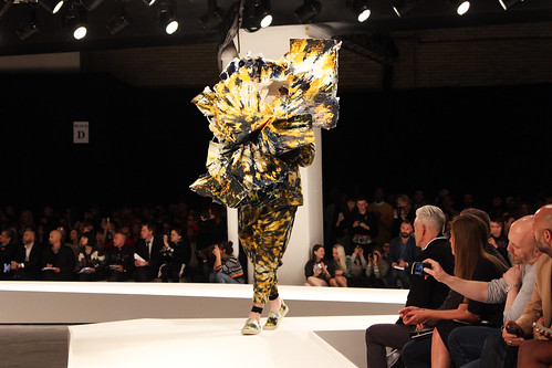
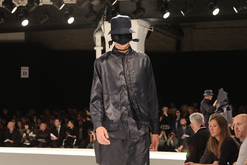
Craig Green spring/summer 14, my snapshots from the front row at MAN.

"Spring/Summer 14 was the first season that we've really sold.  Previously, we used to work on small scale production after the show, a rush of month from start to finish but this season, production has been in tandem with the design of the new collection. A bit of a strain but it's exciting to grow. We jumped from three to twelve stores this season. We're now in Dover Street Market New York and Tokyo, Other-Shop, 10 Corso Como in Milan and  IT in Hong Kong to name just a few."

Whisked into a whirlwind, the last eighteen months must have whizzed by Craig Green's eyes in one marvellous blur of surprise and success but as we wave goodbye to 2013 and with the industry at his feet, I ask what the plan is for 2014 and beyond.

"Every couple of months something good seems to happen. I started out just at the beginning of London Collections: Men and I've been lucky because I get to sell at the time of everyone else and there's a real platform and network of support through Fashion East and CFE. It's exciting to be a part of it. I'd love for it to grow to a point in which I can pay people properly, rely less on favours and to move out of my mum's house. That would all be lovely but I love it all. I get to work with my friends doing what I love and we have a great time. In that we're lucky," he adds with another grin. Enveloped by the craft and smiles of Craig Green, we are all lucky.