.

Showing posts with label Interviews. Show all posts

Inspired... Lou Dalton AW13

Since launching her own line in 2005, Lou Dalton has refined a well crafted reputation for rebellious English sportswear with a keen eye for and attention to detail whilst establishing herself as the real shining starlet of British Menswear. As London menswear has demanded an ever increasing presence at LFW and respect far beyond the perimeter of the capital, evolving from an afternoon in to three full days of shows, presentations, previews, installations and exhibitions under the umbrella of London Collections: Men, Dalton has matured in the spotlight, built a brand and helped pave the way forward. 

One week today, all eyes will be on the blossoming design talent once more as she opens the sophomore edition of London Collections: Men. Having had a sneak preview of the collection which includes an exciting shoe collaboration, tactile knitwear and soft tailoring to obsess over and further evolved signatures,  I'm certain she will take more confident and assured steps forward, beckoning the rest of London menswear to do the same. As a little teaser to what Dalton will unveil in seven days, we sit down with the designer to talk through the narrative and influences behind the season. Sitting in her East London studio I was quickly transported six hundred odd miles to the coastlines of Shetland as the designer excitedly talked me through her mood board. Escape with us...

"This season I returned to one of my favourite films, Local Hero. I had watched it a while back but shortly after showing Spring/Summer 2013, my partner Justin was away and I rummaged through all of my old DVDs and found it again along with Ryan's Daughter. I have referenced Ryan Daughter to a small extent, there's just one scene from the film where the freedom fighters are on the beaches pulling in the illegal arms and they're wearing these oil skins in the pouring rain and I was drawn to the scene's rawness and how dark it was, in particular the Irish terrain and the backdrop that it is set against. The small village that the film is set shares characteristics to that of Shetland as captured in Bill Forsyth's feature. For me, Local Hero is one of the best films that I've ever seen, set in a place that I have such fond personal memories of. I met Justin in Shetland over nine years ago and I spent three years commuting back and forth from the area during the early years of our relationship. It it is quite simply one of the most amazing places that I've been to. I think Laurence Ellis' film (that he shot for my autumn/winter 2010 collection) captures the essence of how Shetland is, it's this open, amazing, wild place but it is so warm and welcoming. I absolutely loved spending time there and I have this crazy dream of owning a croft at some point. It will always be an inspiring place to me.

When I watched Local Hero again with Burt Lancaster playing a Texan oil worker who goes out to this rural town in the Scottish highlands with the desire to build a whopping big oil rig but soon falls in love with the special place. Theoretically, that's what happened to Shetland. At one point, it was the biggest oil port in Europe. I latched on to this development in a sense but it had much more to do with the characters, the terrain, the rawness and everything about the area. I loved everything about the film and it reminded me about my own experiences. I started pulling references from there, from utility and work wear after looking at the boy on the rig, the city boy in the country feel influenced the tailoring and there's a particular fabric that we've pulled from an Italian mill that reminds me of the flock and rawness of the sheep whilst the knitwear takes inspiration from the identification markings on the sheep which has this form of branding. 

I know that when I talk about being inspired by Shetland, people will think "oh, this is Lou being right country, a heritage feel' and there might be an element of that but once you see the collection, you'll see that there's much more to it than that. This particular collection feels even more personal whilst the fit and shapes are very much from spring/summer. I want the guy that is buying Lou Dalton to feel confident and trust in the continuation from season to season..."


Lou Dalton_AW13_Local Hero - Movie Poster
IMG_9647
IMG_9671
Lou Dalton_AW13_Ryan's Daughter_Storm
IMG_9656
IMG_9650
IMG_9651
IMG_9658
IMG_9667
Snapshots of Lou Dalton's mood board for AW13.

"I do feel the pressure of showing first (at London Collections: Men). Everyone has been so supportive and I never do anything half heartedly. This collection means an awful lot and there's shedloads of work still to do. I won't settle until it is all done, to the level that I want it to be at. I said it to Charlie Porter previously but if I could get the label the point of being a self financed menswear designer from the UK that can compete with those big boys then that would be a massive achievement. It's unchartered territory. I think the label is at the point at which it could soar to the next level or stagnate and I desperately want it to fly on. I feel as though I've pushed myself harder than ever for this collection and we've also been pushing at the same time with production of Spring/Summer 13 which was the largest that it has ever been. It'll be quite special if I pull everything off."

I have every confidence that she will. Long may London menswear follow the lead of Lou Dalton. Here's to London Collections: Men and beyond.

Exclusive: Casely-Hayford SS10 Look Book and Interview

The Casely-Hayford duo applying the finishing touches to their wonderful offering at Menswear Day.

Before the festive break we mentioned that we would have an exclusive gift for you on the 29th and right on time, we can now deliver our late Christmas present to you....the first look at Casely-Hayford's SS10 look book along with an interview with our favourite design duo. One of the real highlights of the extended Menswear Day back in September was Casely-Hayford's collection entitled Kings of the Kings Land. Inspired by the raw energy of Kingsland Road (where their studio is based) they unveiled a new style tribe, the 'Afropunk.' For the benefit of those who live outside of London, this seemingly unique and unconventional corner of the city is where original EastEnders co-exist with the more recently landed public school boys. This incongruous social mix conjures up a rich sartorial vocabulary which the Casely-Hayford's have used to create a new English style.

The first look at Casely-Hayford's SS10 look book.

Steve left the Fashion East Menswear Installations inspired by what he had seen but was impatient to learn more about this collection in particular. With this in mind, we caught up with Charlie and Joe to talk about the collection in more detail and to find out about their exciting plans for the year ahead whilst revealing their SS10 look book for the very first time...

A new form of sartorial mix. English Wedgewood style fused with Turkish Ottoman prints.

SS: The collection was inspired by the sights and sounds of Dalston's infamous road, Kingsland Road. What is it about this part of East London which makes it so special and so inspiring?
Casely-Hayford: We've always been interested in the idea of 'the trans-cultural' - an enriched summation of many cultures to create a unified whole, forming a sartorial mix which is unique to the UK and possibly at it's most direct in London. For us, this area of London perfectly captures the spirit simply by walking from one end of the Kingsland Road to the other. It is possible to experience some of the worlds most prominent cultures, and we wanted to echo this mood in our collection. We are excited by the way that new conclusions are drawn from this cultural fusion.

The English DNA of the brand is fused with the colour and ornamentation of beautiful prints and hard-egded far-eastern embellishments.

SS: Your first two collections have seen you fuse elements of traditional English tailoring with facets of sportswear and this one sees you continue this sartorial cocktail with the unexpected addition of African elements to the mix. Do these combinations reflect the two of you in anyway, or perhaps the interchange and evolution of your own aesthetics?
Casely-Hayford: It wasn't so much the African element that initially enticed us - it was the similarities between the powerful youth culture of London Punks and the age-old aesthetics of traditional tribal wear. The synergy between the two seemed interesting and relevant to an emerging subculture that was as of yet undefined. We were able to retain the English DNA of the brand whilst fusing it with the colour and ornamentation of these beautiful prints and hard-egded far-eastern embellishments.

A unique combination of the delicacy of the Casely-Hayford aesthetic mixed with the raw energy of the anarchic youth created a trans cultural sartorial punk that we came to define as the 'Afropunk'. All the essential Casely-Hayford elements are still central to our statement, we are simply introducing another facet.

We have spent a lot of time discussing how we define culture and both agree that it is something which is not static. For each generation there is a defining point. We felt that with this collection we could begin to touch on an aesthetic shift from one decade to the next.

Introducing the Afropunks

SS: You unveiled the 'Afropunk', as part of the extended Menswear Day at LFW, how has the reaction been to your new style tribe? And did you have a chance to enjoy the day at all?
Casely-Hayford: The reaction has been overwhelming! We didn't really expect it. It's funny that through making a stronger visual statement we seem to have connected with a wider audience. People have been keen to embrace our vision. The Casely-Hayford sartorial mood prevails but through countering cliched notions of luxury we have been able to celebrate fine craftsmanship in a modern context.

It is always difficult presenting a personal statement to the public where the designer's intention transcends the power of the viewer's interpretation, but throughout the day we were pretty surprised by the positive reaction we received from a wide and diverse range of individuals.

Rather than doing a runway show, from the very beginning we made a decision that our seasonal statement would be in the form of a selection of images that reflected the brand identity. We are interested in creating something for the few, rather than reaching out to every man. Last LFW was an exception that appealed to us because it was the 25th anniversary. The Menswear Day was significant in finally creating something credible for buyers and press in London that wasn't dominated by womenswear.

Relaxed, luxurious tailoring... English Wedgewood style.

SS: The moment Steve walked in to your space inside Somerset House's East Wing, he was struck by how meticulously styled and cast the collection was and this has been continued through to the look book. Do you enjoy the styling aspect? What was the inspiration for the ornate embellishment of Turkish prints?
Casely-Hayford: I think there are very few designers that style their own collections. But it is a major part of the process for us. There's such a strong narrative behind each garment, the story would be incomplete if the stylistic vision was not carried through with exacting measure. We felt that the ornate patterns formed the perfect cross over point between English Wedgewood style and Turkish Ottoman prints.


The "hankersleeves" featured in the look book and presentation seem to have caught a lot of people's attention. We were looking at tribal notions of beauty and wanted to utilise the metal hoops that various African tribes use to elongate areas of their body such as the neck and arms. We used colourful hand rolled silk handkerchiefs from Suffolk to anglicise the look and make it our own.

A closer look at the much talked about 'hankersleeves'.

SS: 2009 has been a huge year for Casely-Hayford, what have been the highlights for you both?
Casely-Hayford: It's been an amazing year. Being approached by several top international retailers was a major endorsement of what we are doing. Collaborating with Swaroskvi on their first ever menswear project along with Lanvin and Phillip Lim has been really exciting... and working on this new project with John Lewis has been so fulfilling. I don't think there's been anything like it before - it's essentially a celebration of 'the Best of British' under one umbrella. Each season my father will be designing a complete wardrobe and collaborating with some of the most highly respected British heritage brands for John Lewis to create new unique garments. We received some of the samples just before Christmas and they look really strong. The first items should be in store from the end of February. Lulu inviting us to take part in London Fashion Week as part of Fashion East was obviously also another highlight of the year.

We are sure to replicate Casely-Hayford'd styling when the warm sunshine returns next year.

SS: What are you looking forward to in 2010? And...can you share any hints as to what you'll be showing in February 2010 and beyond?
Casely-Hayford: 2010 will hopefully be a year of greater international expansion for the brand. We've been approached by some interesting stores over the last few months who we hope to work with in the near future.

Autumn is a little darker and harder than previous collections, Focusing more on craftsmanship and quality... but once again pushing the boundaries of English sartorialism and British anarchy.

Two final looks at SS10 before we begin looking forward to the year ahead.

A festive weekend with b Magazine

IMG_9420

"The b family is not just fashion people and the store is not just for fashion people, it has a wider ranging reach than that" affirms Dal Chodha whilst tucking in to a Cinnamon bun in Soho's Nordic Bakery. "With all of the labels that it sells and has sold, none of them are pure fashion brands and that is precisely why the magazine isn't pure fashion, it just wouldn't make any sense if it were. It is a snapshot on how the b store customer lives. It is a mood board of their interests as much as it is ours" he smiles.  We've met to discuss the fifth issue of b magazine and toast the tenth anniversary of b Store.

Now, as readers of this blog you should all know that London’s b store has long been a mecca for contemporary design. Whilst nurturing some of the best design talent in the capital and beyond, b store have been merging art, fashion and design seamlessly for ten years now. When Jason and Dal talked to b's very own Matthew Murphy and Kirk Beatie about the store as they first mooted the idea of a magazine it soon became clear that it contrary to its name, the b store is more than just four walls of retail.  They described it as a world, the b store world and the eponymous publication explores this ever evolving and fascinating realm. As b store celebrates its tenth anniversary and moves in to its new home on Kingly Street, the fifth issue of b magazine reflects but also looks forward and, as seemingly with anything b related, excites.

"It is going out amongst a sea of titles. I used to love buying bi-annuals and I still do to some extent but I do feel that many are saying the same things to me" reveals Chodha with a discernible air of disappointment before defiantly declaring, "for Jason and I, it just makes us work harder. We want to make something that isn't like the other titles out there in what we cover." As with each visit to the institution of retail that is b Store, there is the chance to discover a new designer, an exhibition, a magazine or even just a moment when you talk to them and leave with something new. You can always expect to be surprised and the magazine echoes this spirit wonderfully. Just as the store has always been more than just a physical space, b magazine is more than a bi-annual.

From the first moment I picked up the debut issue of the store's publication back in September, it was clear that is was not your average fashion magazine. Created by long term collaborator and collection stylist Jason Highes and editor Dal Chodha, the title exposes the wider b Store ethos; passion in design and integrity in individuality with a knowing nod to more sartorial affairs. It sells ideas and it sells information. Editorially driven, b magazine looks at creatives from a wonderfully unique angle. It is a title to immerse yourself in and always is a pleasure to thumb.

IMG_9408
From Chodha's interview with designer Martino Gamper.

Highlights of the issue include the Observer’s Eleanor Morgan highlighting the restaurateurs and meeting chefs behind some of London’s most exciting eating experiences from noodles made by foot in Soho to pigs heads in Shoreditch and Dal Chodha talking to the affable furniture designer Martino Gamper in his Hackney studio about his crusade for good mass-market design, while also stealing a look at Nancy Rohde’s chamomile lawn and Ally Capellino’s grape vines. However, the real gem is Ben Purdue's look at the origins of and continued evolution of the store.

IMG_9376
A snapshot of b Store included in 'A Decade Under The Influence'

"It was really difficult at first to think about how we could cover the tenth anniversary. We never want the issue to feel like an advert for b store and thankfully people haven't see it like that. It has never been that and we didn't want to start on the fifth issue. It was difficult to dedicate such a big portion of the features to this subject without it being 'Oh, how amazing is the b store!?', immediately we knew it couldn't be something that I could write so we brought the lovely Ben Purdue in. Also, the people that we quoted had to people that we had never spoken to previously, we could very easily get a quote from Peter or from Christophe, but it was important to hear from the likes of Roksanda Ilinic, Mandi Lennard and Maureen Paley."

IMG_9381
Christophe Lemaire gives thanks and celebrates the anniversary

Ben Perdue's reflective piece on a decade under the influence of b is packed full of choice quotes from friends and family of the store but there is one in particular line that is still bouncing around in my brain. Designer Roksanda Ilinic uttered, "They were and still are a laboratory for creative design and spirit." This simple line rings true and cuts to the very core of what makes b so special. PR legend and former neighbour of the store agrees by adding, "The b store customer was a real person, and it was about a respect for good design - particularly the new wave of designers coming through." b have always been ambassadors for and facilitators of young talent. Much in the same way as the boys have championed emerging talent on the rails of each incarnation of the store, Hughes and Chodha showcase this same spirit within the pages of b magazine. By shooting the likes of (deep breath) Casely-Hayford, Agi&Sam, Matthew Miller, Mohsin Ali, One Nine Zero Six, Satyenkumar and Christophe Lemaire to name but a small selection, the editorials are unlike any other title.

IMG_9382
A Casely-Hayford blazer, top by Kye and shorts by Champion from 'The Luxury Gap' editorial shot by Laurence Ellis and with fashion by Jason Hughes.

"Our stockists pages is incredible because it really is so different from every other stockist page. It is about new-ness. We love looking for new things but not new fangled things that are short-lived. We'd never do a trends page for example. Casely-Hayford, Stephan Schneider, Christophe Lemaire are all labels that the store either sells or will never sell but nevertheless like. We purposely feature brands that you won't see in every other title. Jason has a brilliant way of pulling in these labels that you never think of, or would see them in that way. Designers that lend to us really enjoy seeing the results of what we do. Raimund for example, whose profile is building, is stunned when Jason styles his designs because he always shoots them in a way that surprises him and the Japanese socks by Ayame that grace the cover, certain people in fashion wear them but its about seeing them in a different light, its a case of reinvention. Alot of the pieces in that shoot were made for it and at times, that might be frustrating because we are a consumer title and it might leave them wanting things that they can't have, but with a biannual, you should be pushing the boundaries. We can be creative in that way."

IMG_9402 
Jacket and trousers by Agi&Sam and poloneck by John Smedley. From the 'Dubbing in the backyard' editorial, shot by Willem Jaspart and with fashion by Jason Hughes.

"We were an incubator. We never intended to be a luxury brand store and if a label gets above a certain point, it isn't for us anymore. If their brand evolves and they become something else then, of course, they should go on to do other things. Some have fallen by the wayside but some are extremely successful, and it's been great seeing that" Matthew Murphy.

IMG_9394 
Suit custom made for story by Satyenkumar and t shirt by Topman Design. From the 'Dubbing in the backyard' editorial, shot by Willem Jaspart and with fashion by Jason Hughes.

"It's about the same size as the last issue but it feels heavier. In terms of the balance between copy and images, there might be more imagery than previous issues and the fashion stories themselves require more attention than ever before. They require more time to take them in, Willem's cover story for example. This being our fifth issue, we decided to move them more than ever. We wanted to surprise the readers. You can't rest on just being a good magazine, it is never enough and you always have to do more, something different."

IMG_9419
Part of London's most exciting dining experiences, Koya's John Devitt pictured with his favourite dish.

Much in the same way as there's a definite sense of b store maturing with the unveiling of the beautiful and custom furnished new Kingly Street space and numerous projects, b magazine grows with each issue. "With this issue more than ever, we've highlighted the idea of getting real experts in their field, Eleanor writes about food for the Observer, Teal who did the piece on Fanzines has written two books on the subject and is also a professor and course director at the London College of Communication" Chodha proudly states. The focus on building the already impressive list of contributors with respected individuals who have a real specialism in what they discuss, is something that is surprisingly quite unique. "There are a number of other titles who use wonderful writers but few have a real specialism."

IMG_9373
Cathy Lomax's Arty magazine

"We haven't ever done anything that feels contrived or forced, It has to be natural and getting someone like Eleanor Morgan onboard, for me was really exciting because we want people with authority. As a consumer, after five issues of a magazine you do start wondering, am I going to continue buying it? You have to justify why people should continue to buy the title. We're working towards this. Firstly by guaranteeing that none of the information we print will be available anywhere else in any way, shape or form and secondly, it is important for people to feel like they are getting specialist advice or information. The title has definitely grown up, it helps to have people like Teal and Eleanor with their expertise and reputation on board. I feel proud that they like what we are doing and that they want to be involved in it as much as we want them to be involved in it."

IMG_9370
Patrick Fry's No Zine

Given the anniversary, it came as little surprise that Chodha had moments of endearing reflection; "As the magazine is so much of what Jason and I and the boys are about at the b store, it would have to be something very different in a further ten years time and maybe, it might not be as relevant as it is now. It is important for us that we see it as something that is 'very now.' I'd much rather it have impact than for it to run out of steam or become stale."

At this moment in time, I cannot fathom b magazine ever becoming stale. The world b magazine weaves through and explores means that it is a publication that is nigh on impossible to put down. From the gardens of creatives to bodies of lesser known work, it concerns itself with the unexpected, uncharted or undocumented. It deals in everything with reassuring familiarity rather than the fantasy or purely aspirational that we have all grown accustomed to in the sea of fashion titles. One thing is for certain, this fifth issue, despite being well thumbed already will provide a welcome haven from the over indulgences of this festive period.

Inspired... Kit Neale AW13

"Fashion East Installations give the newest of the new in London menswear the chance to prove their worth in a group show of delicious controlled anarchy," proclaims Charlie Porter in the recent press release for autumn/winter 2013. Ever since they were introduced to the London fashion week schedule back in 2009, I've excitedly bounced from room to room inside its various incarnations uncovering the beautiful alongside the wonderful and even the unusual at every opportunity. The platform provides discovery at every turn for us whilst offering invaluable exposure for the designers themselves and often acts as a springboard for them. Nothing quite represents the diversity of London menswear design talent quite like the Fashion East Menswear Installations. Returning to the impressive and ornate Georgian townhouse in the heart of St. James’s alongside Meadham Kirchhoff, Bobby Abley, Joseph Turvey, Nasir Mazhar and Maarten van der Horst, Kit Neale will once again be a noisy neighbour to Buckingham Palace for the day.

Ever since I first stepped in to Kit Neale's dazzlingly printed world,  a cultural kaleidoscope that reimagined suburban and multicultural Britain, I've been eager to return. Despite being just over two weeks away from London Collections: Men, I couldn't resist popping by his new showroom cross studio located just off Shoreditch High Street for a sneak peek at how the new season is taking shape. Moving on from his Dad's allotment and the ever eccentric great British seaside, the emerging sartorial chronicler of our age looks to his design heroes and ends up sozzled in his local. Reviving him with the rustling of a bag of pork scratchings, Kit Neale talks us through his mood board and allows us to take a sip from his heady cocktail of influences...

"The real starting point was looking at three of my design heroes of Michael Clark, Ray Petri and Ernő Goldfinger. I'm always researching them. I'm obsessed. Ray Petri's 'Buffalo' book has pride of place in the studio, it's our bible and I always look through it and I know many other labels look to it as well. I'm really drawn to those Buffalo days and often look through my old issues of The Face and Arena Homme Plus. I think Petri, Goldfinder and Clark all have a level of influence over or appear in some way in every season but I wanted to delve a little deeper and fuse all three in to this collection but it wasn't possible to look at all three due to this being such a short season so I chose to focus on Clark. It's been a bit tight this season and this shows in the fact that the prints have just come back, the Friday before Christmas but I'm really pleased with them.

There's a film that Michael Clarke did with Leigh Bowery called Hail The New Puritan. It's a fake documentary, a mix of narrative, performance and fantasy. If you've not seen it, you really should watch it on youtube. The vivid colours of the film really inspired the prints for this season. There's one particular scene where they are in a typical British, slightly run down pub and the contrast and clash with these colourful characters is so intriguing. It led me to think about the role of the pub in society, they're a place where all types congregate and it also directed me to all of the pop references. I looked at so many names, signs and details of pubs but in the end we concentrated on The White Polar Bear and The Queen's Head. The prints combine the pub detailing with the vivid colours of the film and the movements of Michael's Clark's dance."

IMG_9543
IMG_9502
IMG_9532
IMG_9529
IMG_9519
IMG_9506
IMG_9599
IMG_9582
IMG_9564
IMG_9550
IMG_9570
IMG_9517
IMG_9489
IMG_9586
IMG_9590
IMG_9469
A few snapshots peering in to Kit Neale's mind.

Much like looking at Martin Parr's photography which can at first appear exaggerated, Kit Neale's plentiful prints fuse the familiar with the strange, the mundane with the extraordinary. Entering his presentation space last season I was instantly transported back home to the sandy beach of Margate and I'm looking forward to going off on a jaunt to one of the designer's locals to share a pint with his design heroes. What's your poison?

Fox and Flyte

SS 9
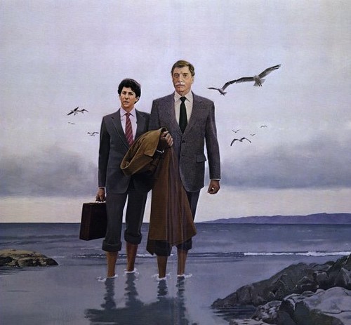
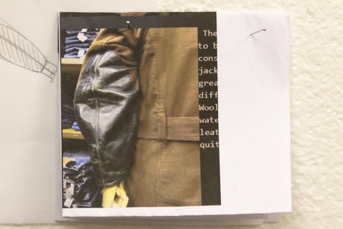
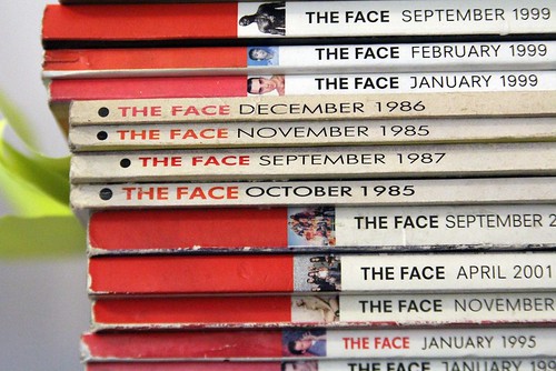
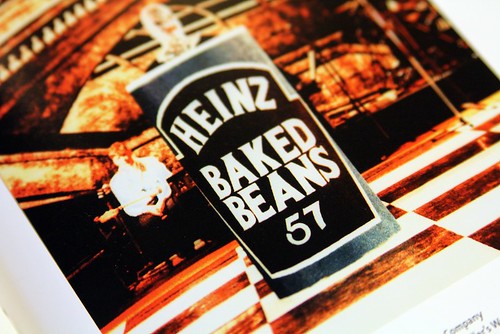
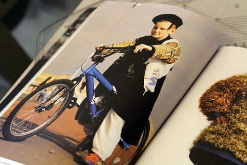
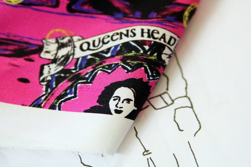
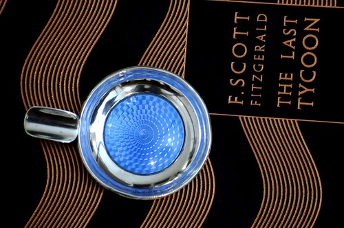
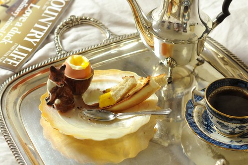
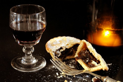
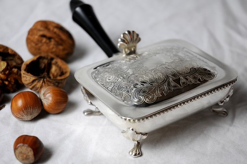
An assortment of goodies from Fox and Flyte.

Trawling through markets and auctions for that perfect something can be a lot of fun but it can also be a nightmare of pain and wasted hours. During this time of widespread festive fuelled consumer abandon in particular, the thought of physical shopping is not that enticing. Thankfully, the recent unveiling of Fox and Flyte, a new online purveyor of well chosen vintage collections, can help you unearth a hidden gem of an item from the comfort of your home.

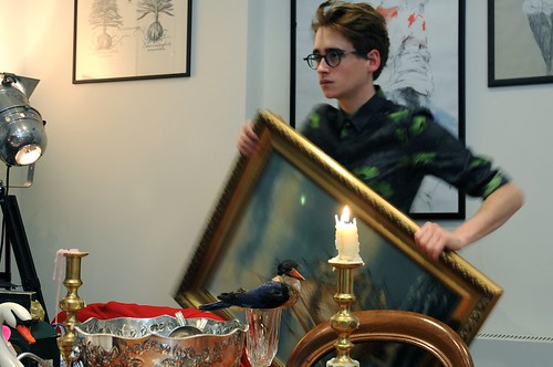
Fox and Flyte began as an idea between three close friends with a shared aesthetic, a passion for beautifully made things and a longing for grandeur. Duncan Campbell, Haeni Kim and Luke Edward Hall do the hunting and the user gets the handpicked and lovingly restored treasure. The trio combine their vast knowledge in the careful selection of the finest, most charming objects they can find. Abiding by William Morris' belief that having beautiful things in your home can improve the quality of your life, and the love and skill put in by the maker can reside in the object, and contribute to the life of the person who ended up with i, the friends certainly have a respect for craftsmanship and stewardship. From butter knives to taxidermy to Church's loafers, the site is a wonderfully curation of surprises but however different the items first appear they are linked through their shared quality, craftsmanship, value and an enticing beauty that forces you to click. Shortly after the store opened, we caught up with the trio behind it to talk shop, antiques and collaboration...

SS 14


SS: What were your inspirations, your dreams, and the driving catalyst behind Fox and Flyte?
Fox and Flyte: The three of us have been friends for a long time and it was our dream to work together on a project one day. It was really about spending time together at the beginning and creating something. We spent a lot of time going to markets and auctions before we started Fox and Flyte and have always had an interest in beautifully made things and interiors so right from the outset that was a driving force.

SS 6

Of course when it comes to antiques, you can spend your whole life devoted to the study of one small area or period, so we were never claiming to be experts but we felt that antiques are generally perceived to be stuffy and expensive and thus inaccessible to many, which doesn’t have to be the case at all. It was very important to us that the Fox and Flyte website not only presented these beautiful objects in a user-friendly fashion but also made them available and attractive to a new audience. The internet is such a great medium for it because it opens this world up to everyone. The potential outreach is limitless but in our experience, we found lots of great antiques dealers but not many great antique websites so that's what got us thinking. Lastly, we started Fox and Flyte with very little budget, no investors and no premises to open a shop, so a website that was clear and easy to use felt like a good idea.

SS 3

It was much more about an aesthetic we love, combined with a way of working that tries to be a tiny bit altruistic. We live in an era of outsourced production, landfills and everything made of plastic. While it would be naïve to think that we could change this on our own, it didn’t feel like we wanted to contribute further to this situation. One of the most amazing things about antiques is that they are already here! It is very exciting for us to think about a time when things were made with care, skill, and even love. William Morris believed that having beautiful things in your home could actually improve the quality of your life, and the love and skill put in by the maker would actually reside in the object, and contribute to the life of the person who ended up with it. This might be a bit over the top if you’re talking about a teapot or a butter knife as opposed to a tapestry or a sculpture, but it’s really about a respect for craftsmanship and trying not to fill the world with more rubbish unnecessarily. I think we wanted to see whether we could introduce a new audience to this way of thinking, who perhaps may have never known it existed before, or felt they couldn’t be a part of it, as well as to appeal to those who are already interested.

SS 8

SS: What does Fox and Flyte mean to you?
Fox and Flyte: It’s about bringing beautiful things to a new audience, showing young people that these things don’t have to be stuffy or prohibitively expensive, and hopefully, as time progresses, the opportunity to work with and support smaller producers and artisans working in traditional ways and keeping their expertise alive.

SS 18

SS: You seek out objects with a story that have been made with passion and in many cases lovingly restored? Could you talk us through your sourcing methods?
Fox and Flyte: As we found out very early, dealers will never reveal their sources! Every time we bought something for the site, we would innocently ask the dealer where they found their stock, only to be met with a disdainful look. As we fit our work on the website around our other jobs, much of the sourcing takes place at the weekends, in the evenings, or sometimes very early mornings. There are a few auctions we have got to know quite well, as well as markets and fairs but it very much depends on what you find on the day. An auction that had great stock one week could have nothing the next week but that’s the nature of the business and part of the fun! Now that people know we’re doing this, we’ve also started to receive offers both from friends and strangers if they have something curious they think we might be interested in.

SS 16

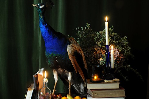
SS: From butter knives to taxidermy to Church's loafers, the site is wonderfully curated. I appreciate that this might be difficult to answer but which are the items that you are most excited and/or proud to have on site?
Fox and Flyte: The taxidermy peacock naturally wins the first prize. He really is a beautiful specimen and we went on quite an adventure to get him. We had been looking for years to find one and when he came into our lives it felt like it was meant to be. When looking for items to stock on the website, we try to hunt out the most curious of objects, and strike a balance between things that are beautiful and purely decorative (and sometimes ridiculous) and pieces that are more useful. We also love the mother of pearl plates we had recently and anything made of interesting materials like shagreen. When we designed the site, we added an archive section so that people could see what we had sold and the kind of things we’re likely to have again.

We love the idea of stewardship, which is particularly relevant to older things, with the idea that they were here before us and will be here when we’re gone, so the time you spend with an item, you’re really only looking after it. Because we don’t have a warehouse space, everything sold on the site lives at home with us before it’s sold. People sometimes ask if we’re sad to see things go, but if we’ve had an adventure finding something, fun photographing, cleaning and restoring it, and then the pleasure of living with it for a few days or weeks, there is almost a feeling of pride when someone buys it because it is moving to a new home and onto the next stage of its life.

SS 10

SS: The site is launched with antique pieces, but you have started to collaborate with small producers on special one-off projects. What can you tell us about these?
Fox and Flyte: As we mentioned above, when we started the site, we really wanted to let it take its natural course and just wait to see what happened. The response was better than we could have hoped, but for us it’s very important to continue to develop, to innovate and of course, grow. We love the idea of working with small producers, initially in the UK, and finding people who we could work with to create small runs of products especially for Fox and Flyte, In our minds, the best collaborations are when both parties come away happy, and you create something better than either one of you could have produced alone. So it’s not about putting a Fox and Flyte label on someone else’s product but sharing our expertise and ideas to create something new. We have a few of these projects in the works but nothing is signed yet, so we won’t say too much, but for us it was really about thinking what would we want to see that we can’t find. If we’re looking for the perfect martini glass, or the most charming pocket square and we couldn’t see it anywhere, then why not make one ourselves? It goes back to our thinking at the very beginning when we sat down and thought to ourselves that we can’t be the only people in the universe who like this stuff!

SS 12

We’d love to collaborate with skilled craftspeople who work in a variety of different fields. We’re thinking about curious objects for the home and person, so eventually we’d like to begin stocking and creating accessories and clothing. One third of Fox and Flyte, Luke Edward Hall, is currently in his final year studying Menswear Fashion Design at Central Saint Martins. He has been producing a small number of shirts and ties in Liberty print fabrics for the website, and we hope to incorporate more of his work into Fox and Flyte when he produces his final collection next year. We have also created a limited run of screen-printed posters with our friend Nicole Thompson, who is an excellent designer and prints all of her work completely by hand. As well as this, we’ve been working quite closely with the architectural designer Ben Pentreath, who has a shop in Bloomsbury, which has been a brilliant experience. We had a pop-up shop there for a few weeks in the autumn, and we plan to work with him again next year. He’s been an excellent mentor for us so far.

For future collaborations it’s important for us to find the right people to work with because it’s about sharing ideas. We can offer a platform to sell, as well as a new audience, and the collaborator can offer a wealth of expertise.

SS 13

SS: What can we expect from Fox and Flyte in 2012 and beyond?
Fox and Flyte: I think as we learn more about this business, hopefully the website will get better and better. One of the comments we get most often is great website, wish there was more stock! Because we fit it into our working lives, and the way we source, clean, style, photograph and describe everything ourselves, this process takes a little bit of time but going into 2012 we are looking at ways to streamline this a bit and to become more efficient. We are also going to start working on more coherent collections of products to launch together, so it could be picnic, or brunch, or the Fox at sea, but it will be twenty or so products all relevant to the theme, all uploaded together. Finally, we are very excited to be getting underway with a few of our first Fox and Flyte product collaborations, which we think people will love. Details to be announced early in the New Year so watch this space!

SS 17
All imagery supplied by Fox and Flyte